1 summarize() this
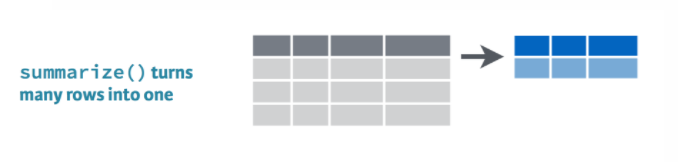
summarize() allows you to apply a summary function like median() to a column and collapse the data down to a single row. To dig into summarize you’ll want to learn some more summary functions like sum(), mean(), min(), and max().
sum()
Use summarize() and sum() to find the total credits from all the scrap.
summarize(scrap, total_credits = sum(credits))mean()
Use summarize() and mean() to calculate the mean price_per_pound in the scrap report.
summarize(scrap, mean_price = mean(price_per_pound, na.rm = T))Note
What’s the average of missing data? I don’t know.
Did you see the na.rm = TRUE inside the mean() function. This tells R to ignore empty cells or missing values that show up in R as NA. If you leave na.rm out, the mean function will return ‘NA’ if it finds a missing value anywhere in the data.
median()
Use summarize to calculate the median price_per_pound in the scrap report.
summarize(scrap, median_price = median(price_per_pound, na.rm = T))
max()
Use summarize to calculate the maximum price per pound any scrapper got for their scrap.
summarize(scrap, max_price = max(price_per_pound, na.rm = T))
min()
Use summarize to calculate the minimum price per pound any scrapper got for their scrap.
summarize(scrap, min_price = min(price_per_pound, na.rm = T))
sd()
What is the standard deviation of the credits?
summarize(scrap, stdev_credits = sd(credits))
quantile()
Quantiles are useful for finding the upper or lower range of a column. Use the quantile() function to find the the 5th and 95th quantile of the prices.
summarize(scrap,
          price_5th_pctile  = quantile(price_per_pound, 0.05, na.rm = T),
          price_95th_pctile = quantile(price_per_pound, 0.95))
Hint: Add na.rm = T to quantile().
n()
n() stands for count.
Use summarize and n() to count the number of reported scrap records.
summarize(scrap, scrap_records = n())Explore!
Create a summary of the scrap data that includes 3 of the summary functions above. The following is one example.
summary <- summarize(scrap,
                     max_credits      = __________,
                     weight_90th_pct  = quantile(Weight, 0.90),
                     count_records    = __________,
Explore!
Use summarize and n() to count the number of reported scrap records going to Niima outpost.
Hint: Use filter() first.
niima_scrap <- filter(scrap, destination == "Niima Outpost")

niima_scrap <- summarize(niima_scrap, scrap_records = n())
What if we wanted to count the number for each destination?
Too much
That sounds like a whole lot of summarizing.
It’d be nice if we could easily find the mean for every city. Then we could summarize once and move on.
2 group_by() what
Bargain hunters
Who’s selling goods for cheap? Use group_by with the column Origin, and then usesummarize to find the mean(price_per_pound) at each Origin City.
scrap_summary <- group_by(scrap, origin) %>%
                 summarize(mean_price =  mean(price_per_pound, na.rm = T))
Rounding digits
Rounding
You can round the prices to a certain number of digits using the round() function. We can finish by adding the arrange() function to sort the table by our new column.
scrap_means <- group_by(scrap, origin) %>%
                 summarize(mean_price       =  mean(price_per_pound, na.rm = T),
                           mean_price_round = round(mean_price, digits = 2)) %>%
                 arrange(mean_price_round) %>%
                 ungroup()
Note
The round() function in R does not automatically round values ending in 5 up. Instead it uses scientific rounding, which rounds values ending in 5 to the nearest even number. So 2.5 rounded to the nearest whole number rounds down to 2, and 3.5 rounded to the nearest whole number rounds up 4.
Who’s making lots of transactions? Try using group_by with the column origin and then summarize to count the number of scrap records at each city.
scrap_counts <- group_by(scrap, origin) %>%
                summarize(origin_count  =  n()) %>%
                ungroup()
Spock-tip!
Ending with ungroup() is good practice. This prevents your data from staying grouped after the summarizing has been completed.
3 Save files
Let’s save the mean price summary table we created to a CSV. That way we can transfer it to a droid courier for delivery to Rey. To save a data frame we can use the write_csv() function from our favorite readr package.
# Write the file to your results folder
write_csv(scrap_means, "results/prices_by_origin.csv")
Warning!
By default, when saving R will overwrite a file if the file already exists in the same folder. It will not ask for confirmation. To be safe, save processed data to a new folder called results/ and not to your raw data/ folder.
4 Grouped mutate()
We can bring back mutate to add a column based on the grouped values in a data set. For example, you may want to add a column showing the mean price by origin to the whole table, but still keep all of the records. This is a good way to add values to the table to serve as a reference point.
How does the price of Item X compare to the average price?
When you combine group_by and mutate the new column will be calculated based on the values within each group. Let’s group by origin to find the mean() price per pound at each origin.
scrap <- group_by(scrap, origin) %>%
            mutate(origin_mean_price = mean(price_per_pound, na.rm = T)) %>%
            ungroup()
Guess Who?
Star Wars edition

Are you the best Jedi detective out there? Let’s play a game to find out.
Guess what else comes with the dplyr package? A Star Wars data set.
Open the data set:
- Load the
dplyrpackage from yourlibrary() - Pull the Star Wars dataset into your environment.
library(dplyr)

people <- starwars
Rules
- You have a top secret identity.
- Scroll through the Star Wars dataset and find a character you find interesting.
- Or run
sample_n(starwars_data, 1)to choose one at random.
- Or run
- Keep it hidden! Don’t show your neighbor the character you chose.
- Take turns asking each other questions about your partner’s Star Wars character.
- Use the answers to build a
filter()function and narrow down the potential characters your neighbor may have picked.
For example: Here’s a filter() statement that filters the data to the character Plo Koon.
mr_koon <- filter(people,
                  mass       < 100,
                  eye_color  != "blue",
                  gender     == "male",
                  homeworld  == "Dorin",
                  birth_year > 20)
Elusive answers are allowed. For example, if someone asks: What is your character’s mass?
- You can respond:
- My character’s mass is equal to one less than their age.
- Or if you’re feeling generous you can respond:
- My character’s mass is definitely more than 100, but less than 140.
My character has NO hair! (Missing values)
Sometimes a character will be missing a specific attribute. We learned earlier how R stores missing values as NA. If your character has a missing value for hair color, one of your filter statements would be is.na(hair_color).
WINNER!
The winner is the first to guess their neighbor’s character.
WINNERS Click here!
Want to rematch?
How about make it best of 3 games?
5 ifelse()
[If this is true], "Do this", "Otherwise do this"

Here’s a handy ifelse statement to help you identify lightsabers.
ifelse(Lightsaber is GREEN?, Yes! Then Yoda's it is, No! Then not Yoda's)
Or say we want to label all the porgs over 60 cm as tall, and everyone else as short. Whenever we want to add a column where the value depends on the value found in another column. We can use ifelse().
Or maybe we’re trying to save some money and want to flag all the items that cost less than 500 credits. How?
mutate() + ifelse() is powerful!

On the cheap
Let’s use mutate() and ifelse() to add a column named affordable to our scrap data.
# Add an affordable column
scrap <- scrap %>%
         mutate(affordable = ifelse(price_per_unit < 500,
                                    "Cheap",
                                    "Expensive"))
Explore!
Use your new column and filter() to create a new cheap_scrap table.
Pop Quiz!
What is the cheapest item?
Black box
Electrotelescope
Atomic drive
Enviro filter
Main drive
Show solution
Black box
You win!
CONGRATULATIONS of galactic proportions to you.
We now have a clean and tidy data set. If BB8 ever receives new data again, we can re-run this script and in seconds we’ll have it all cleaned up.
6 Plots with ggplot2
Plot the data, Plot the data, Plot the data

The ggplot() sandwich

A ggplot has 3 ingredients.
1. The base plot
library(ggplot2)ggplot(scrap)
we load version 2 of the package
library(ggplot2), but the function to make the plot is onlyggplot(). No2. Sorry.
2. The the X, Y aesthetics
The aesthetics assign the columns from the data that you want to use in the chart. This is where you set the X-Y variables that determine the dimensions of the plot.
ggplot(scrap, aes(x = origin, y = amount)) 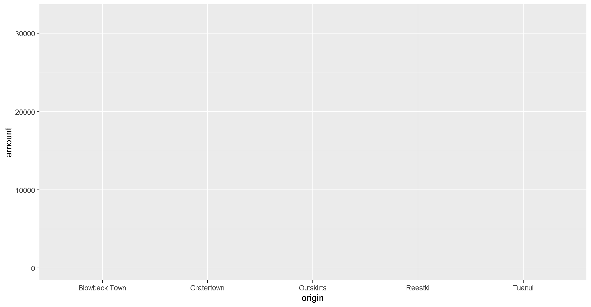
3. The layers or geometries
ggplot(scrap, aes(x = origin, y = amount)) + geom_col()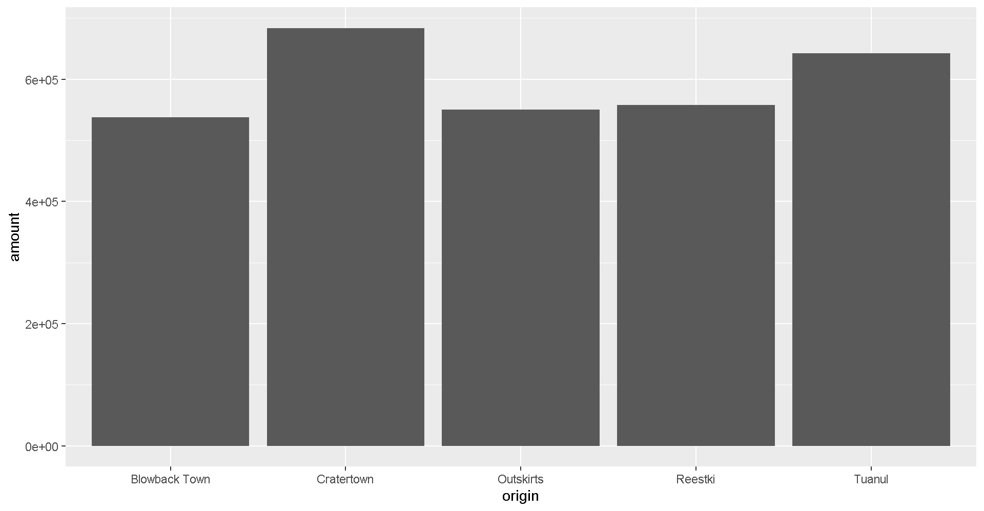
Colors
Now let’s change the fill color to match the origin.
ggplot(scrap, aes(x = origin, y = amount, fill = origin)) +
geom_col() 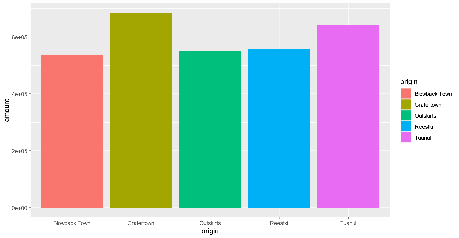
Explore!
Try making a column plot showing the total amount of scrap for each destination or for each item.
ggplot(scrap, aes(x = destination, y = amount )) + geom_col()Explore!
Try making a scatterplot of any two columns.
Hint: Numeric variables will be more informative.
ggplot(scrap, aes(x = __column1__, y = __column2__)) + geom_point()Colors
Now let’s use color to show the origins of the scrap
ggplot(scrap, aes(x = destination, y = credits, color = origin)) +
  geom_point()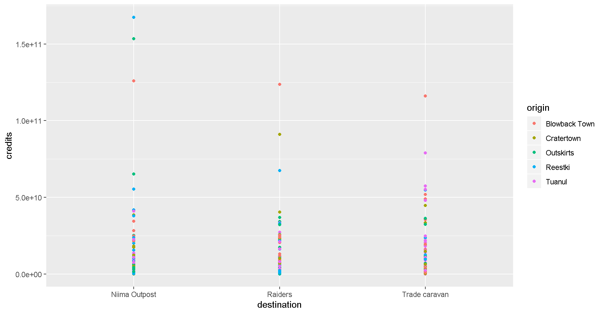
This is a A LOT of detail. Let’s make a bar chart and add up the sales to make it easier to understand.
ggplot(scrap, aes(x = destination, y = credits, fill = origin)) + geom_col()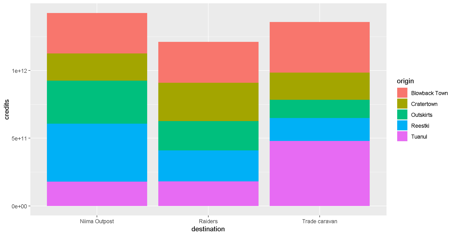
It’s still tricky to compare sales by origin. Let’s change the position of the columns.
ggplot(scrap, aes(x = destination, y = credits, fill = origin)) +
  geom_col(position = "dodge")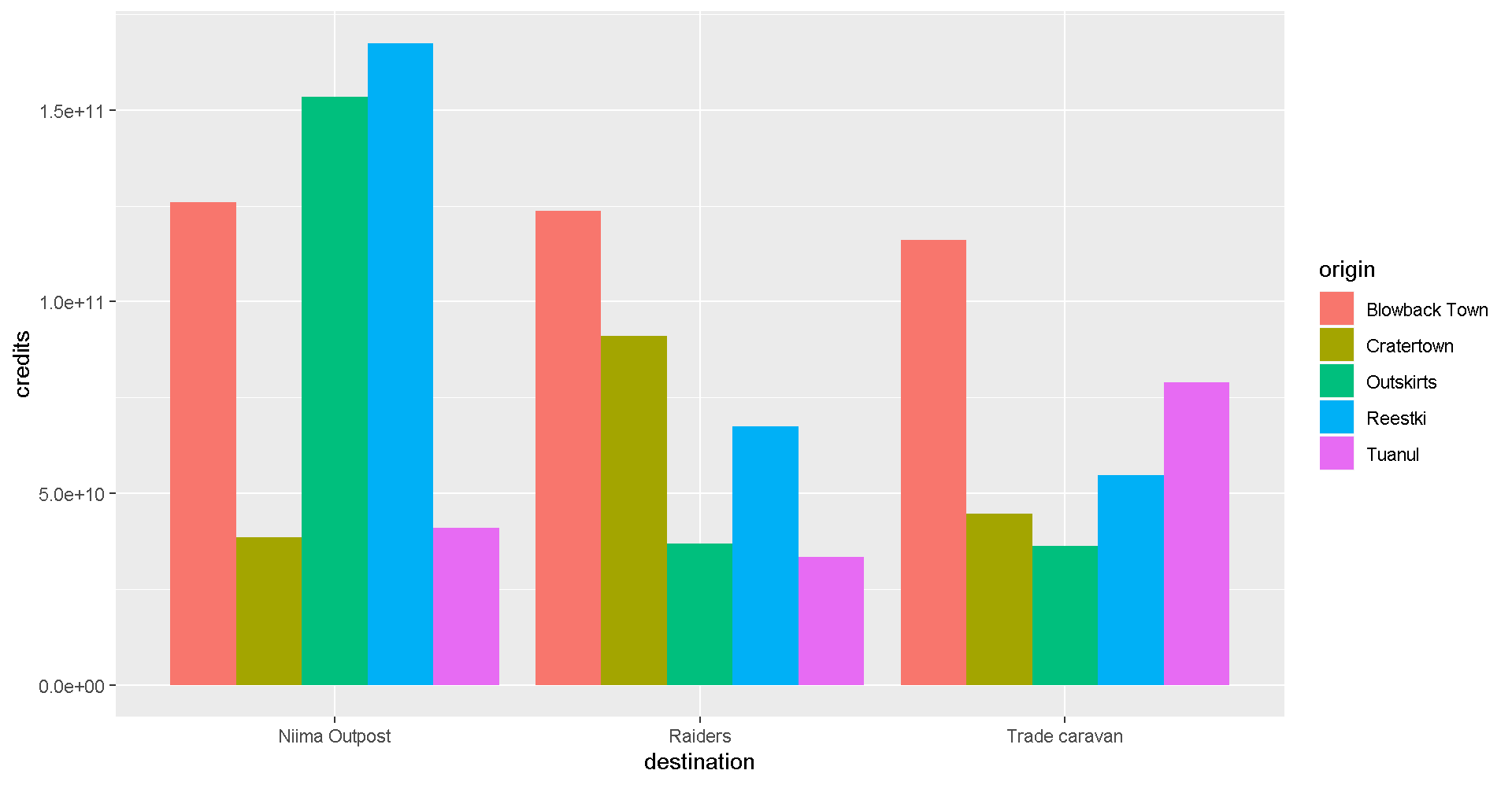
7 More Plots
Colors
Now let’s use color to show the destinations of the scrap.
ggplot(scrap, aes(x = origin, y = credits, color = destination)) +
  geom_point()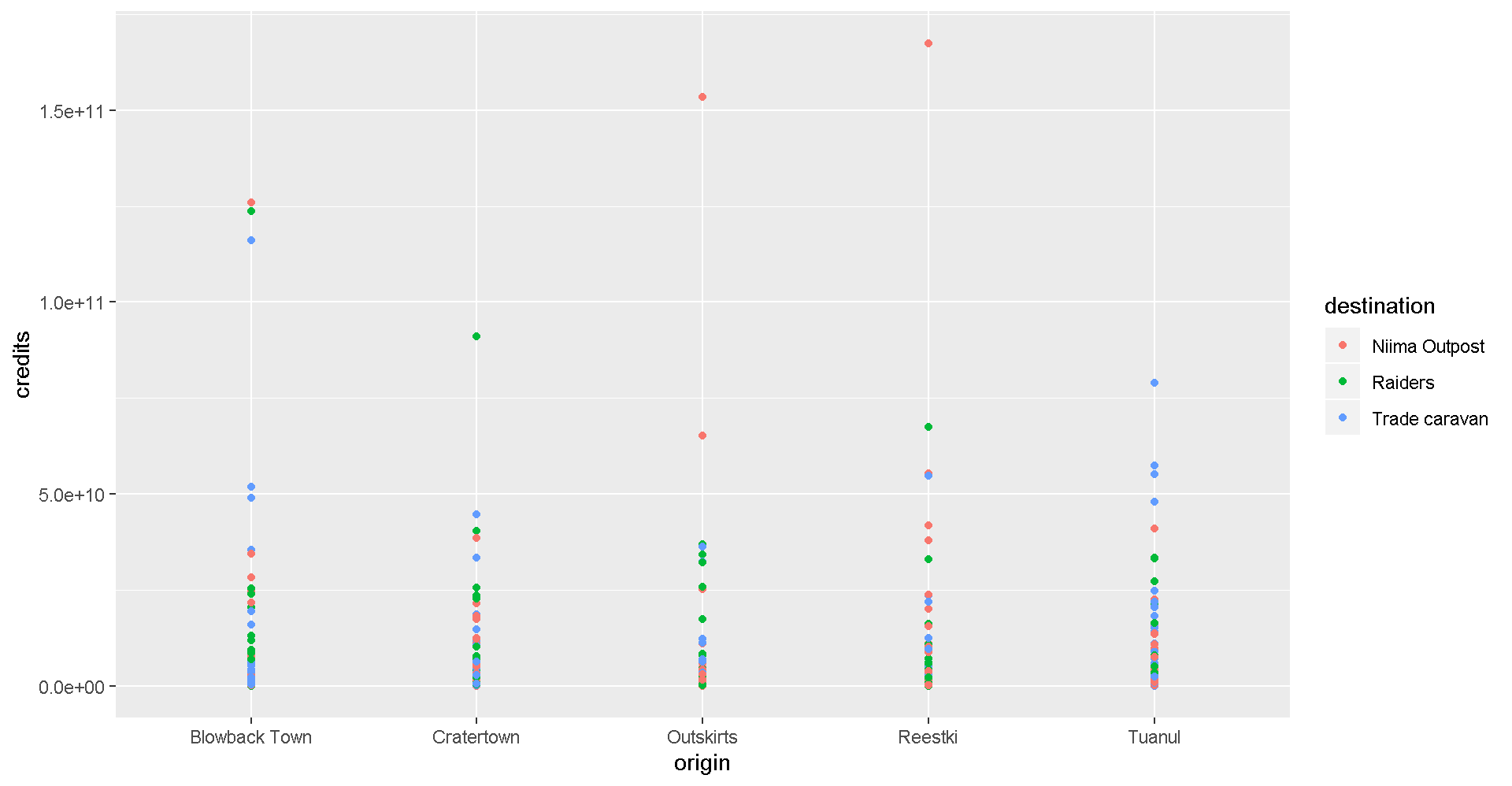
Spock-tip!
One easy way to experiment with colors is to add layers like scale_fill_brewer or scale_colour_brewer to your plot which will link to RcolorBrewer palettes so you can have accessible color schemes.
Bar charts
This is way too much detail. Let’s simplify and make a bar chart that adds up all the sales. Note that we use fill= inside aes() instead of color=. If we use color, we get a colorful outline and gray bars.
ggplot(scrap, aes(x = origin, y = credits, fill = destination)) +
  geom_col()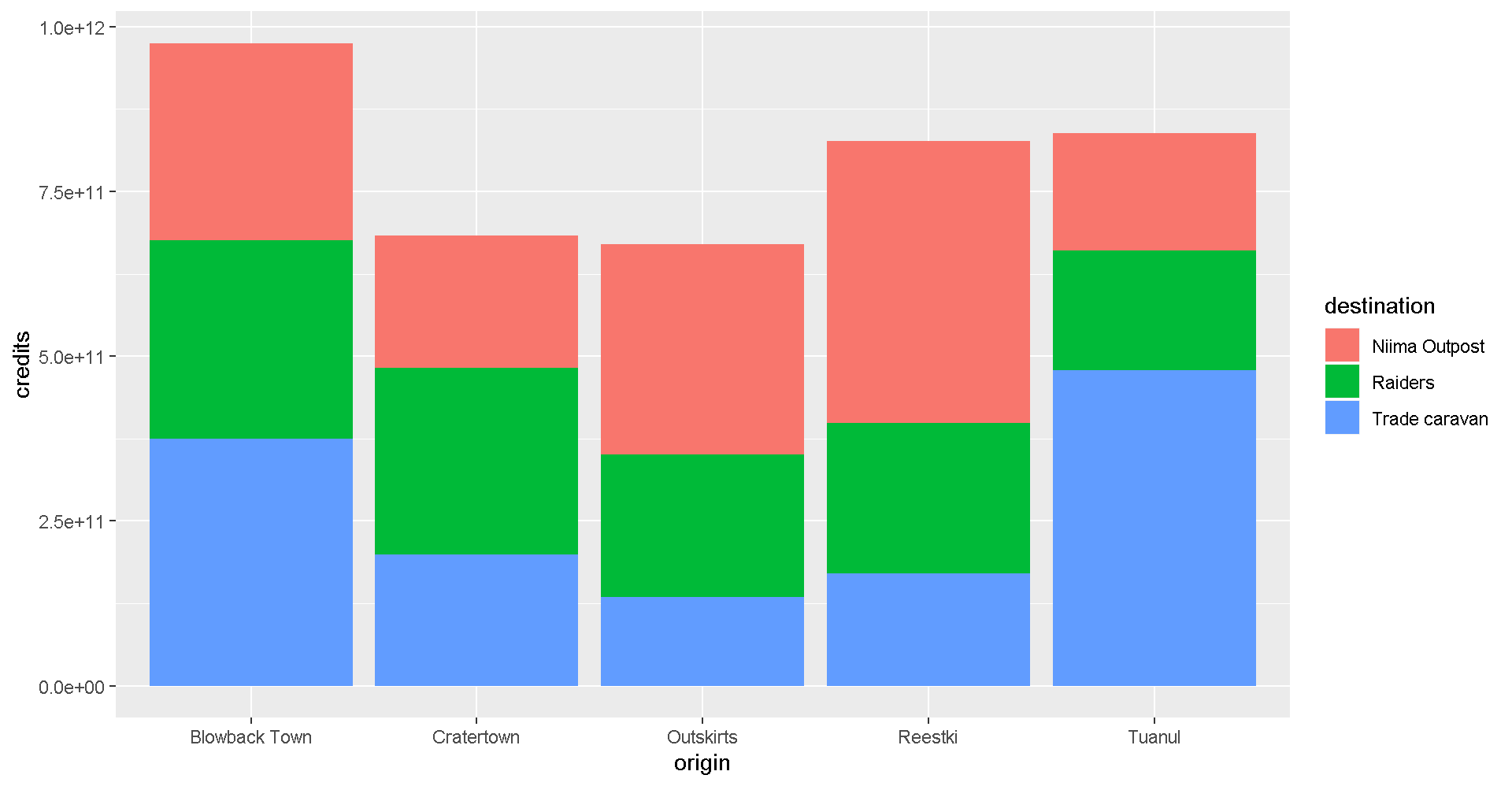
Let’s change the position of the bars to make it easier to compare sales by destination for each origin? Remember, you can use help(geom_col) to learn about the different options for that plot. Feel free to do the same with other geom_’s as well.
ggplot(scrap, aes(x = origin, y = credits, fill = destination)) +
  geom_col(position = "dodge")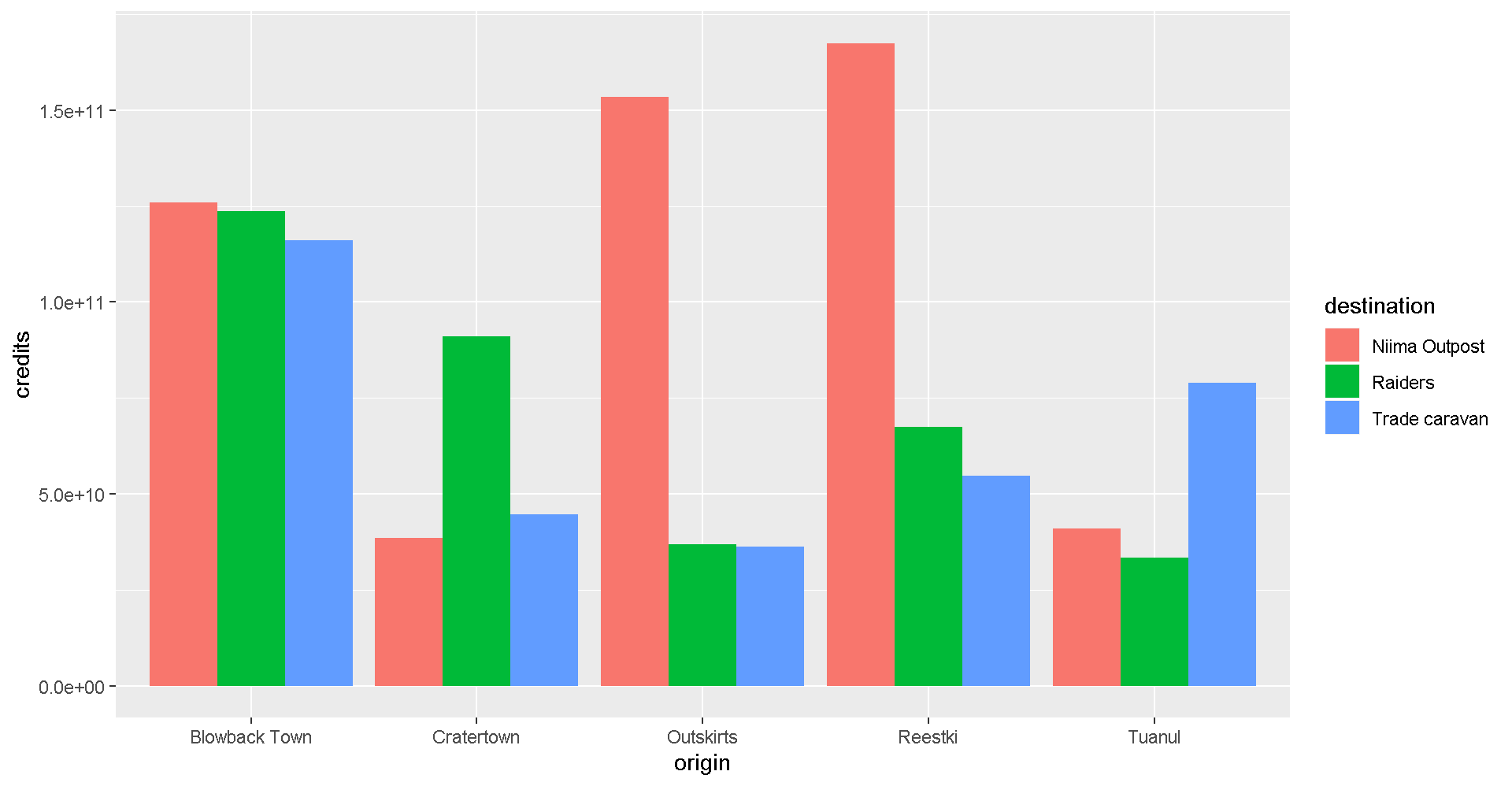
Facet wrap
Does the chart feel crowded to you? Let’s use the facet wrap function to put each origin on a separate chart.
ggplot(scrap, aes(x = origin, y = credits, fill = destination)) +
  geom_col(position = "dodge") +
  facet_wrap("destination")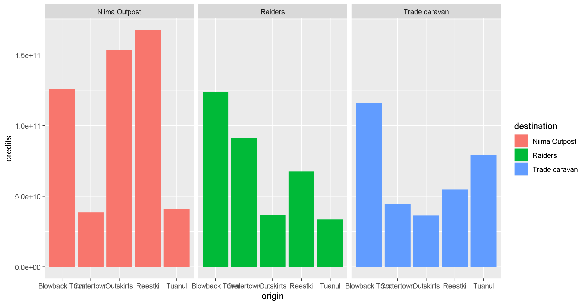
Labels
We can add lables to the chart by adding the labs() layer. Let’s give our chart from above a title.
Titles and labels
ggplot(scrap, aes(x = origin, y = credits, fill = destination)) +
  geom_col(position = "dodge") +
  facet_wrap("destination") +
  labs(title    = "Scrap sales by origin and destination",
       subtitle = "Planet Jakku",
       x        = "Origin",
       y        = "Total sales")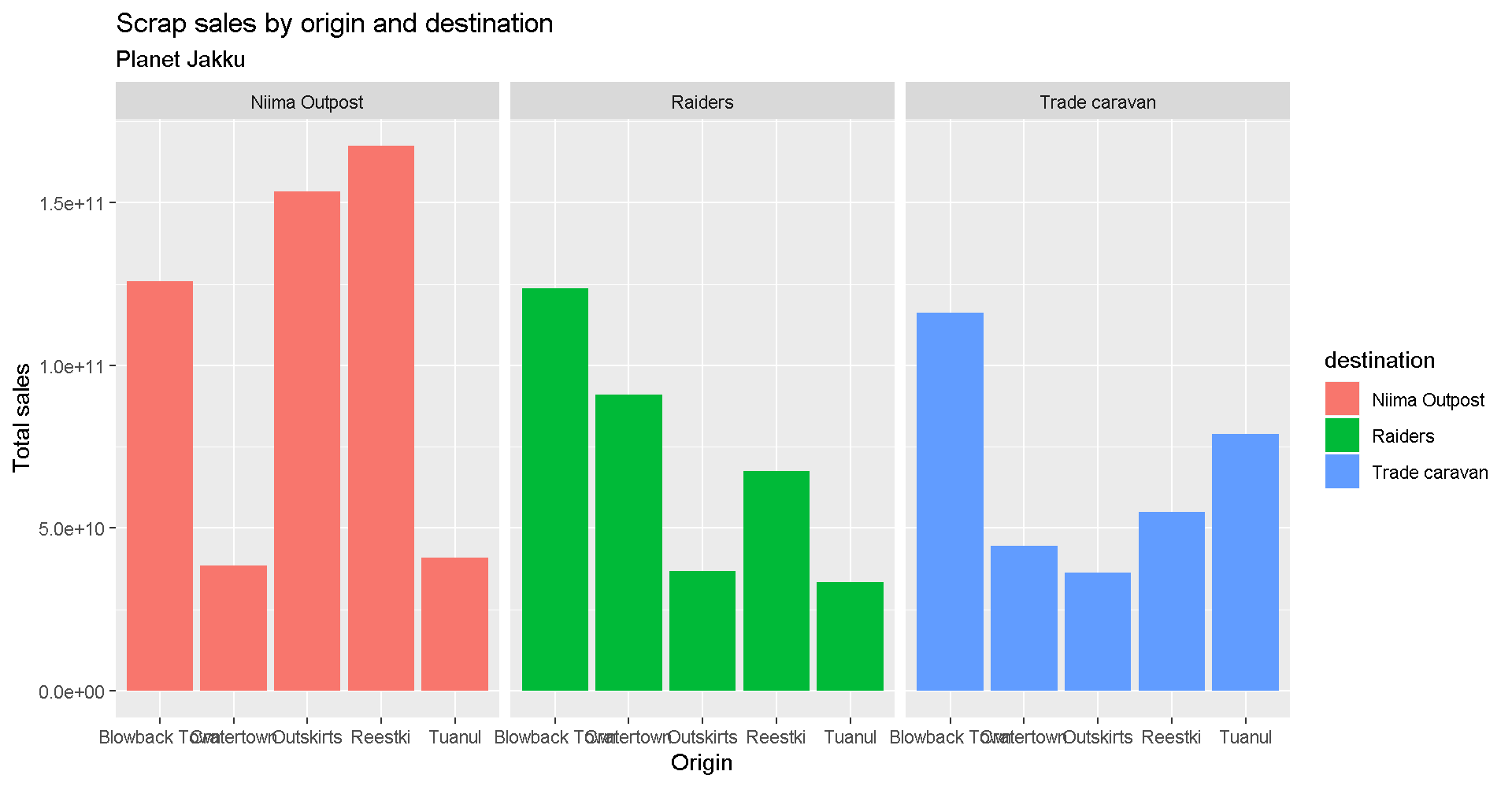
Add lines
More layers! Let’s say we were advised to avoid sales that were over 50 Billion credits. Let’s add that as a horizontal line to our chart. For that, we use
geom_hline().
Reference lines
ggplot(scrap, aes(x = origin, y = credits, fill = destination)) +
  geom_col(position = "dodge") +
  facet_wrap("destination") +
  labs(title    = "Scrap sales by origin and destination",
       subtitle = "Planet Jakku",
       x        = "Origin",
       y        = "Total sales") +
     geom_hline(yintercept = 5E+10, color = "orange", size = 2)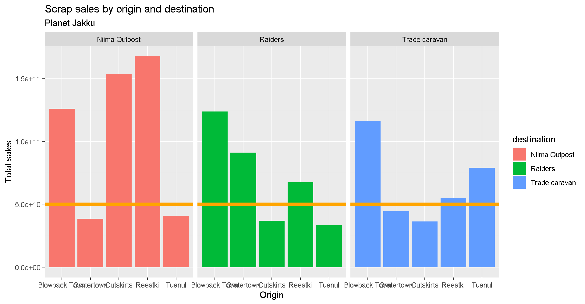
Drop 2.2e+06 scientific notation
Want to get rid of that ugly scientific notation? We can use options(scipen = 999). Note that this is a general setting in R. Once you use options(scipen = 999) in your current session, you don’t have to use it again. (Like loading a package, you only need to run the line once when you start a new R session).
options(scipen = 999)

ggplot(scrap, aes(x = origin, y = credits, fill = destination)) +
  geom_col(position = "dodge") +
  facet_wrap("destination") +
  theme_bw() +
  labs(title = "Scrap sales by origin and destination",
       x     = "Origin",
       y     = "Total sales")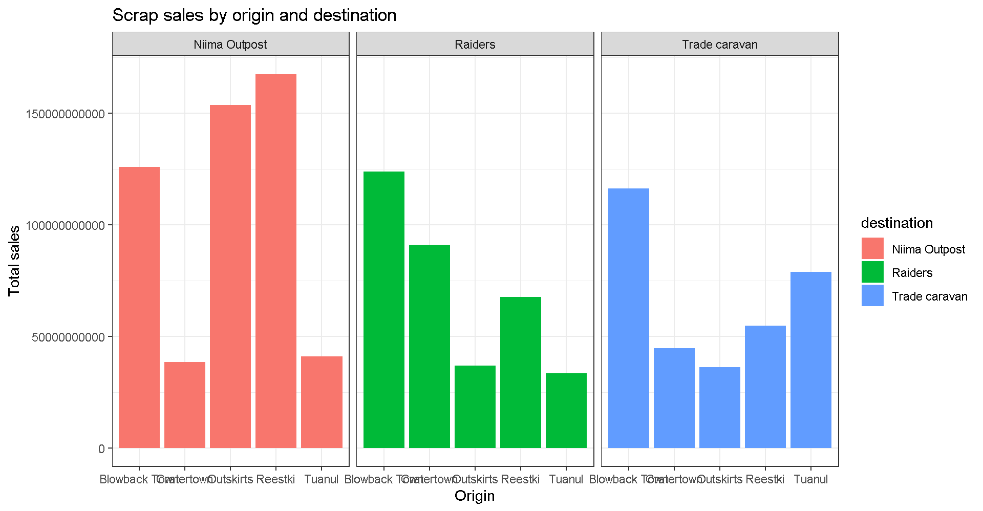
Explore!
Let’s say we don’t like printing so many zeros and want the labels to be in Millions of credits. Any ideas on how to make that happen?
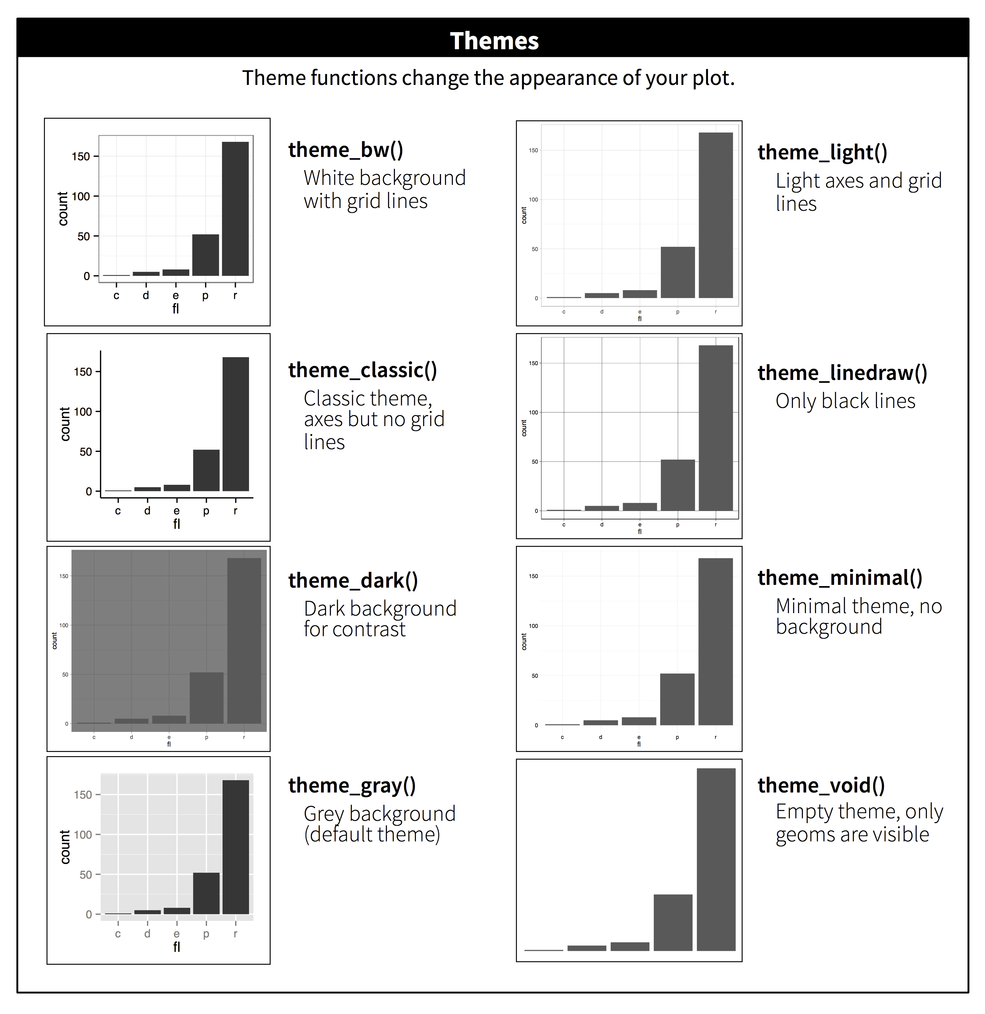
Themes
You may not like the appearance of these plots. ggplot2 uses theme functions to change the appearance of a plot. Try some.
ggplot(scrap, aes(x = origin, y = credits, fill = destination)) +
  geom_col(position = "dodge") +
  facet_wrap("destination") +
  theme_bw()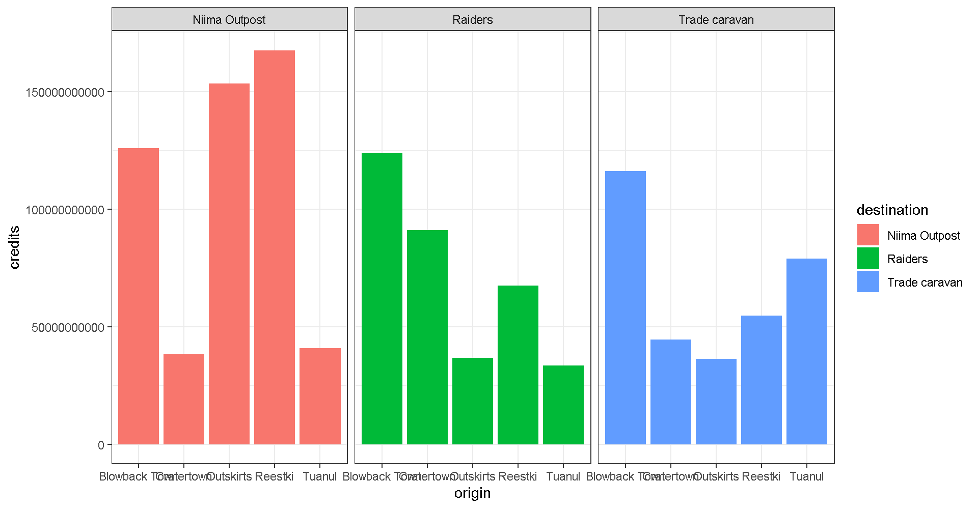
Explore!
Be bold and make a boxplot. We’ve covered how to do a scatterplot with geom_point and a bar chart with geom_col, but how would you make a boxplot showing the prices at each destination? Feel free to experiment with color ,facet_wrap, theme, and labs.
May the force be with you.
Save plots
You’ve made some plots you can be proud of, so let’s learn to save them so we can cherish them forever. There’s a function called ggsave to do just that. How do we ggsave our plots?
Let’s try help(ggsave) or ?ggsave.
# Get help
help(ggsave)
?ggsave

# Run the R code for your favorite plot first
ggplot(data, aes()) +
   .... +
   ....


# Then save your plot to a png file of your choosing
ggsave("results/plot_name.png")
Spock-tip!
Sometimes you may want to make a plot and save it for later. For that, you give your plot a name. Any name will do.
# Name the ggplot you want to save
my_plot <- ggplot(...) + geom_point(...)

# Save it
ggsave(filename = "results/Save_it_here.png",
       plot = my_plot)
Learn more about saving plots: http://stat545.com/
It’s Finn time
Seriously, let’s pay that ransom already.
Q: Where should we go to get our 10,000 Black boxes?
Step 1: Make a geom_col() plot showing the total pounds of Black boxes shipped to each destination.
ggplot(cheap_scrap, aes(x =  ______ , y =  ______ )) +
   geom_
Show code
ggplot(cheap_scrap, aes(x = destination, y = total_pounds) ) +
   geom_col()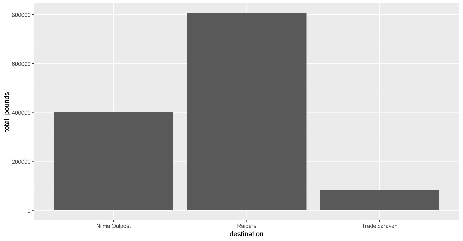
Pop Quiz!
Which destination has the most pounds of the cheapest item?
Trade caravan
Niima Outpost
Raiders
Show solution
Raiders
Woop! Go get em! So long Jakku - see you never!
😻CONCATULATIONS!😻
Woop!
Super-serious kudos to you. You have earned yourself a great award.
Plot Glossary
Table of aesthetics
| aes() |
|---|
x = |
y = |
alpha = |
fill = |
color = |
size = |
linetype = |
Table of geoms
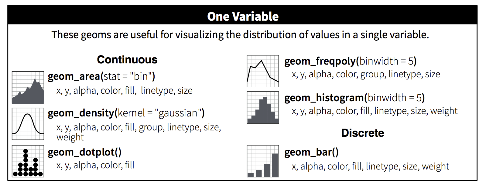
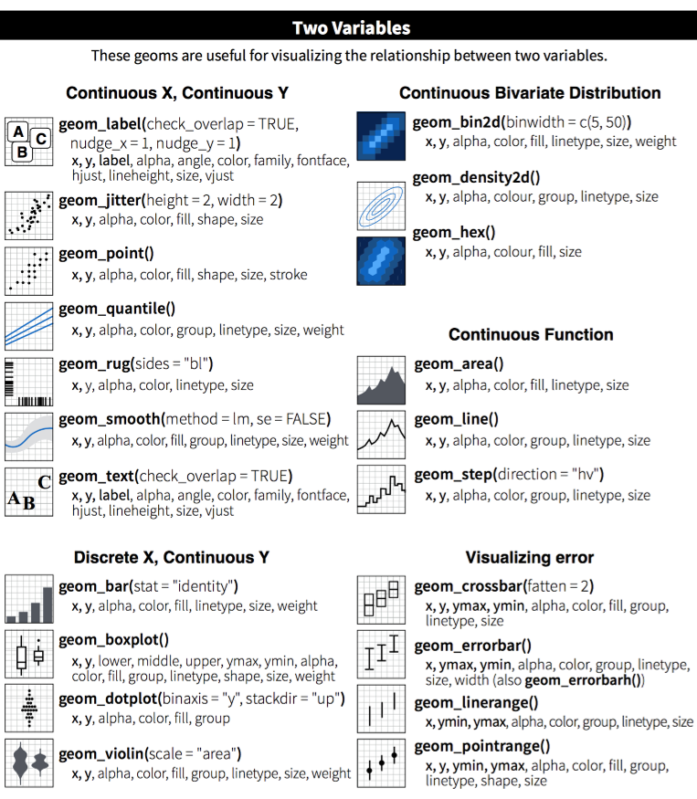
Table of themes
You can customize the look of your plot by adding a theme() function.
Plots Q+A
- How to modify the gridlines behind your chart?
- Try the different themes at the end of this lesson:
theme_light()ortheme_bw() - Or modify the color and size with
theme(panel.grid.minor = element_line(colour = "white", size = 0.5)) - There’s even
theme_excel()
- Try the different themes at the end of this lesson:
- How do you set the x and y scale manually?
- Here is an example with a scatter plot:
ggplot() + geom_point() + xlim(beginning, end) + ylim(beginning, end) - Warning: Values above or below the limits you set will not be shown. This is another great way to lie with data.
- Here is an example with a scatter plot:
- How do you get rid of the legend if you don’t need it?
geom_point(aes(color = facility_name), show.legend = FALSE)- The R Cookbook shows a number of ways to get rid of legends.
- I only like dashed lines. How do you change the linetype to a dashed line?
geom_line(aes(color = facility_name), linetype = "dashed")- You can also try
"dotted"and"dotdash", or even"twodash"
- How many colors are there in R? How does R know
hotpinkis a color?- There is an R color cheatsheet
- As well as a list of R color names
library(viridis)provides some great default color palettes for charts and maps.- This Color web tool has palette ideas and color codes you can use in your plots
- There is an R color cheatsheet
- Keyboard shortcuts for RStudio
- There is a Shortcut cheatsheet
- In RStudio you can go to Help > Keyboard Shortcuts Help
Homeworld training

- Load one of the data sets below into R
- Porg contamination on Ahch-To: “https://itep-r.netlify.com/data/porg_samples.csv”
- Planet Endor air samples: “https://itep-r.netlify.com/data/air_endor.csv”
- Or use data from a recent project of yours
- Create 2 plots using the data.
- Don’t worry if it looks really weird. Consider it art and try again.
Spock-tip!
When you add more layers using + remember to place it at the end of each line.
# This will work
ggplot(scrap, aes(x = origin, y = credits)) +
  geom_point()

# So will this
ggplot(scrap, aes(x = origin, y = credits)) + geom_point()

# But this won't
ggplot(scrap, aes(x = origin, y = credits))
  + geom_point()