Day 1 review
Get to know your Data Frame
| Function | Information |
|---|---|
names(scrap) |
column names |
nrow(...) |
number of rows |
ncol(...) |
number of columns |
summary(...) |
summary of all column values (ex. max, mean, median) |
glimpse(...) |
column names + a glimpse of first values (requires dplyr package) |
Filtering
Menu of comparisons
Symbol Comparison >greater than >=greater than or equal to <less than <=less than or equal to ==equal to !=NOT equal to %in%value is in a list: X %in% c(1,3,7)is.na(...)is the value missing? str_detect(col_name, "word")“word” appears in text?
Your analysis toolbox
dplyr is the hero for most analysis tasks. With these six functions you can accomplish just about anything you want with your data.
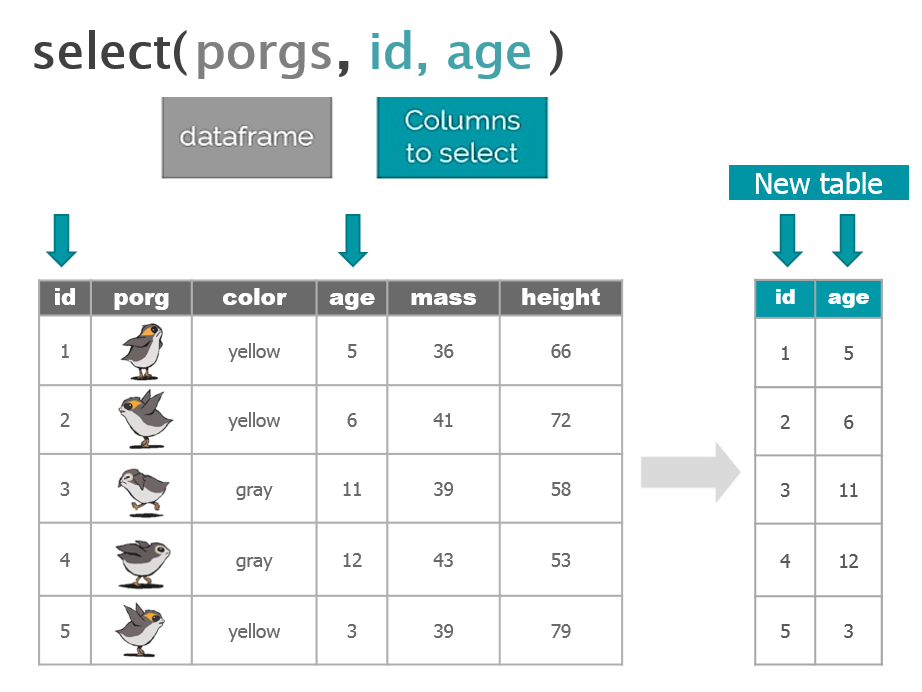
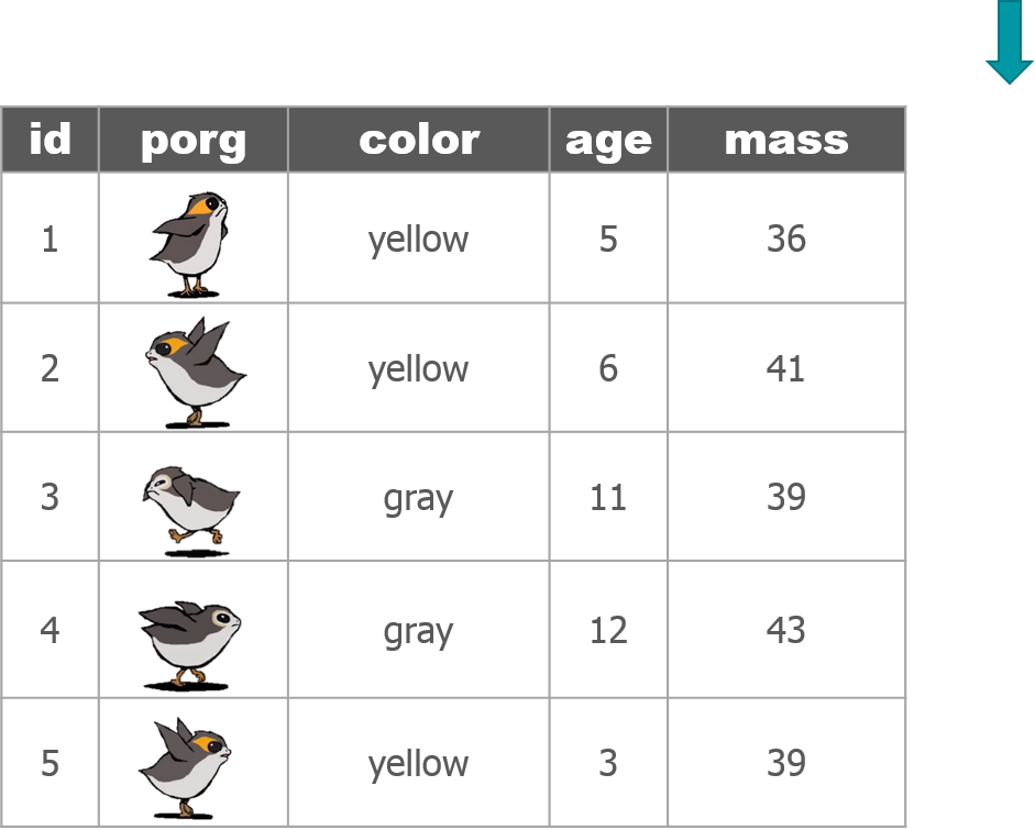
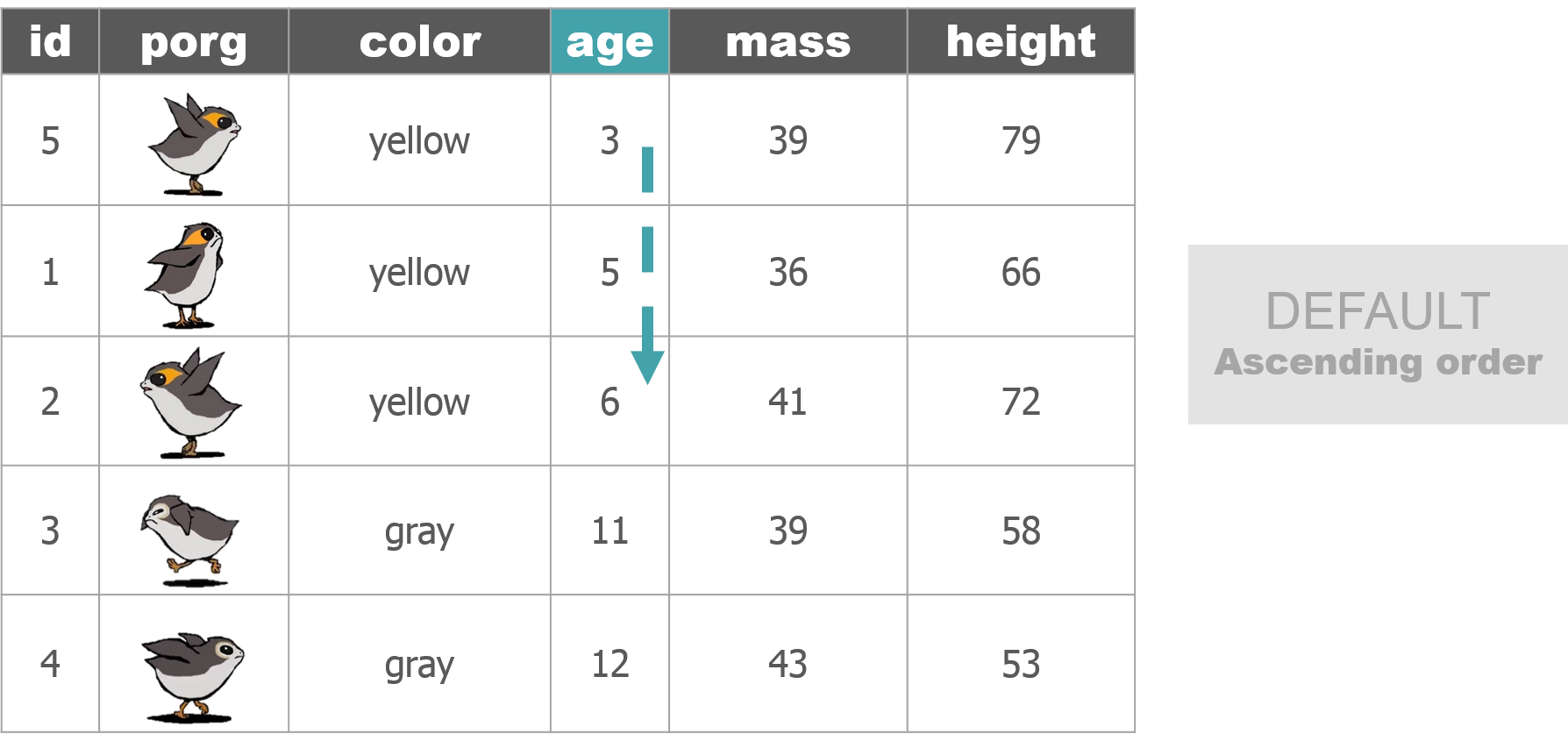
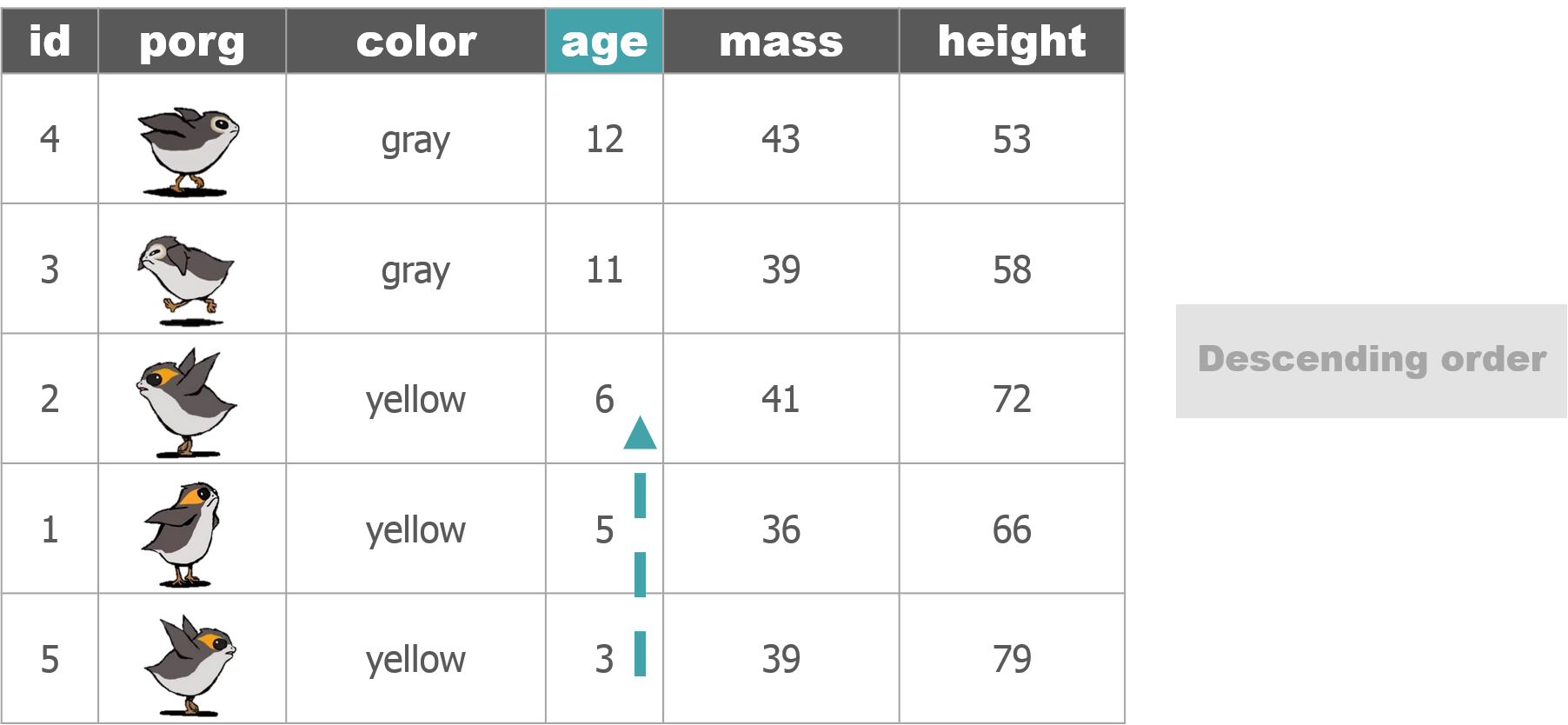
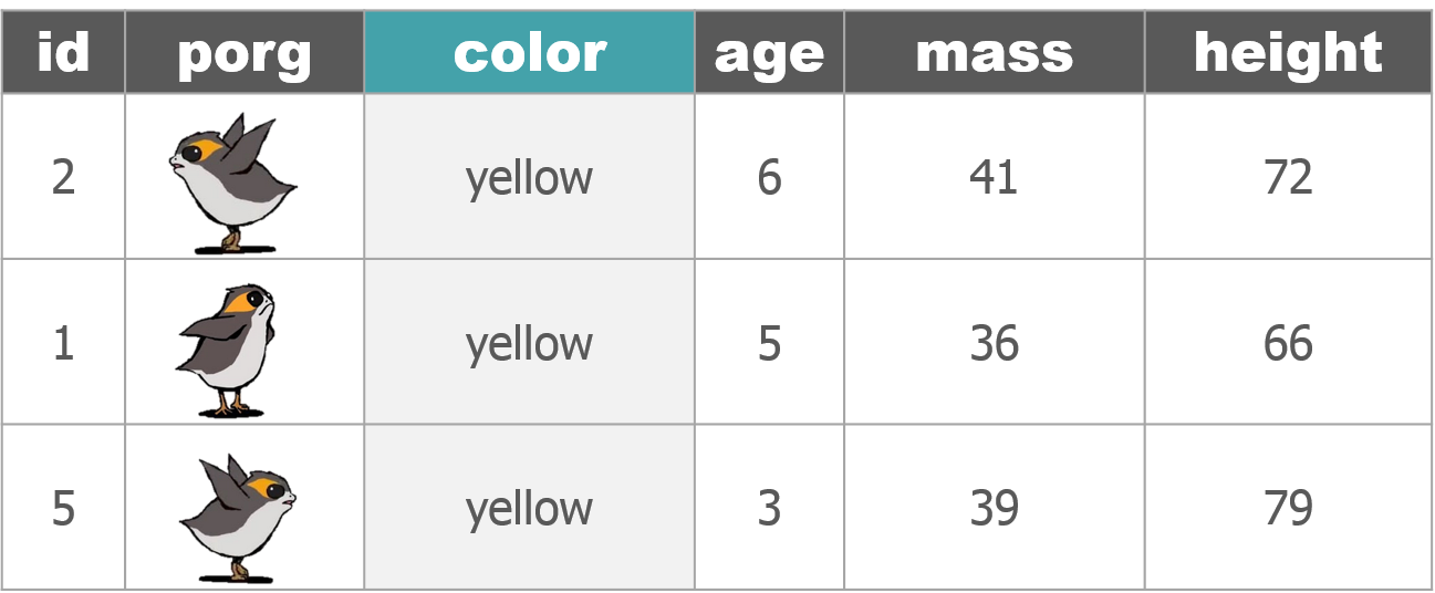
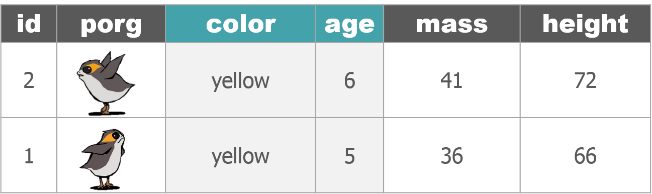
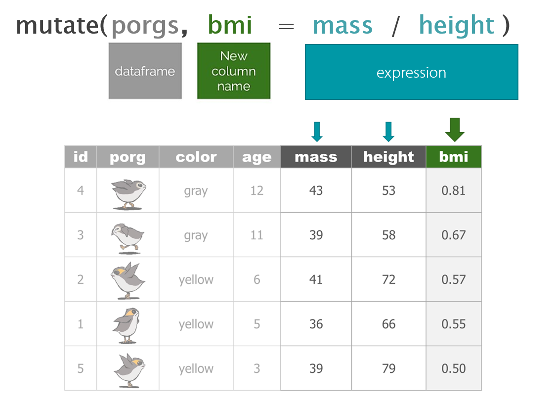
Function Job select()Select individual columns to drop or keep arrange()Sort a table top-to-bottom based on the values of a column filter()Keep only a subset of rows depending on the values of a column mutate()Add new columns or update existing columns summarize()Calculate a single summary for an entire table group_by()Sort data into groups based on the values of a column
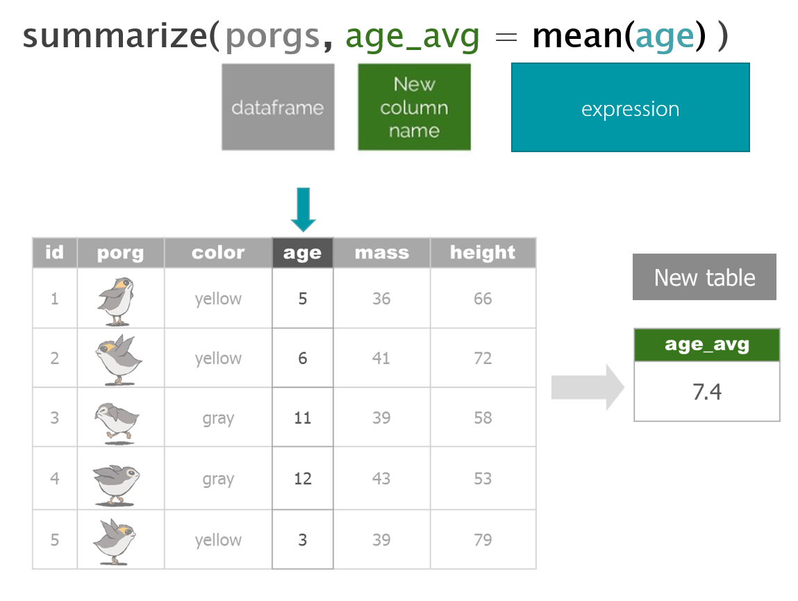
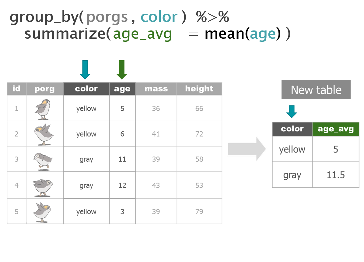
dplyr with Porgs
The poggle of porgs has returned to help us review dplyr functions.


Day 2 review
The ggplot() sandwich

Explore!
Who’s the tallest of them all?
# Install new packages
install.packages("ggrepel")
# Load packages
library(dplyr)
library(ggplot2)
library(ggrepel)
# Get starwars character data
star_df <- starwars# What is this?
glimpse(star_df)## Observations: 87
## Variables: 13
## $ name <chr> "Luke Skywalker", "C-3PO", "R2-D2", "Darth Vader", ...
## $ height <int> 172, 167, 96, 202, 150, 178, 165, 97, 183, 182, 188...
## $ mass <dbl> 77.0, 75.0, 32.0, 136.0, 49.0, 120.0, 75.0, 32.0, 8...
## $ hair_color <chr> "blond", NA, NA, "none", "brown", "brown, grey", "b...
## $ skin_color <chr> "fair", "gold", "white, blue", "white", "light", "l...
## $ eye_color <chr> "blue", "yellow", "red", "yellow", "brown", "blue",...
## $ birth_year <dbl> 19.0, 112.0, 33.0, 41.9, 19.0, 52.0, 47.0, NA, 24.0...
## $ gender <chr> "male", NA, NA, "male", "female", "male", "female",...
## $ homeworld <chr> "Tatooine", "Tatooine", "Naboo", "Tatooine", "Alder...
## $ species <chr> "Human", "Droid", "Droid", "Human", "Human", "Human...
## $ films <list> [<"Revenge of the Sith", "Return of the Jedi", "Th...
## $ vehicles <list> [<"Snowspeeder", "Imperial Speeder Bike">, <>, <>,...
## $ starships <list> [<"X-wing", "Imperial shuttle">, <>, <>, "TIE Adva...Plot a histogram of the character heights.
# Height distribution
ggplot(star_df, aes(x = height)) + geom_histogram(fill = "hotpink")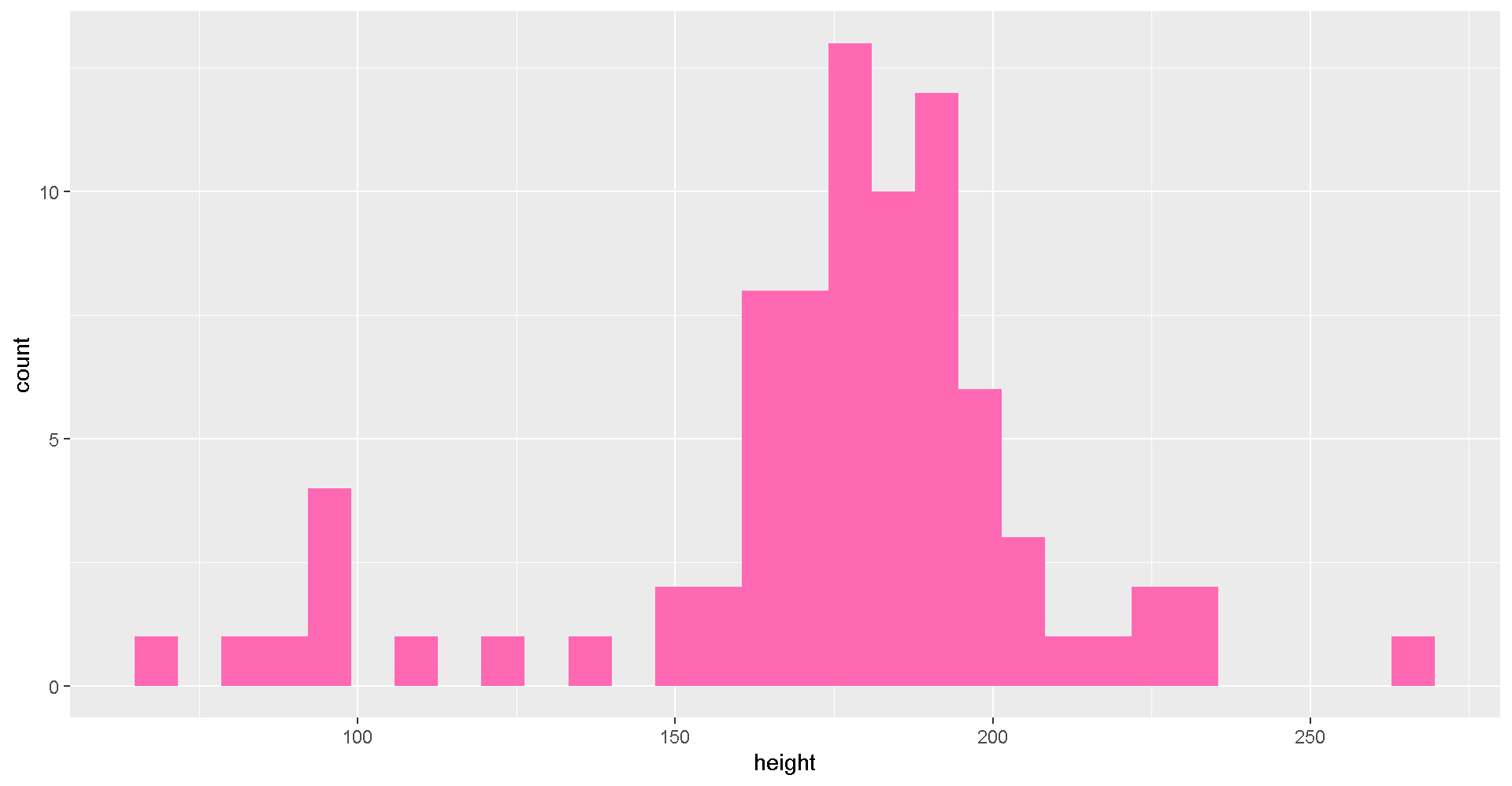
Try changing the fill color to “darkorange”.
Try making a histogram of the column
mass.
Plot comparisons between height and mass with geom_point(...).
# Height vs. Mass scatterplot
ggplot(star_df, aes(y = mass, x = height)) +
   geom_point(aes(color = species), size = 5)
Who’s who? Let’s add some labels to the points.
# Add labels
ggplot(star_df, aes(y = mass, x = height)) +
  geom_point(aes(color = species), size = 5) +
  geom_text_repel(aes(label = name))


# Use a log scale for Mass on the y-axis
ggplot(star_df, aes(y = mass, x = height)) +
  geom_point(aes(color = species), size = 5) +
  geom_text_repel(aes(label = name)) +
  scale_y_log10()
Let’s drop the “Hutt” species before plotting.
# Without the Hutt
ggplot(filter(star_df, species != "Hutt"), aes(y = mass, x = height)) +
  geom_point(aes(color = species), size = 5) +
  geom_text_repel(aes(label = name, color = species))
We can add facet_wrap to make a chart for each species.
# Split out by species
ggplot(star_df, aes(x = mass, y = height)) +
  geom_point(aes(color = species), size = 3) +
  facet_wrap("species") +
  guides(color = FALSE)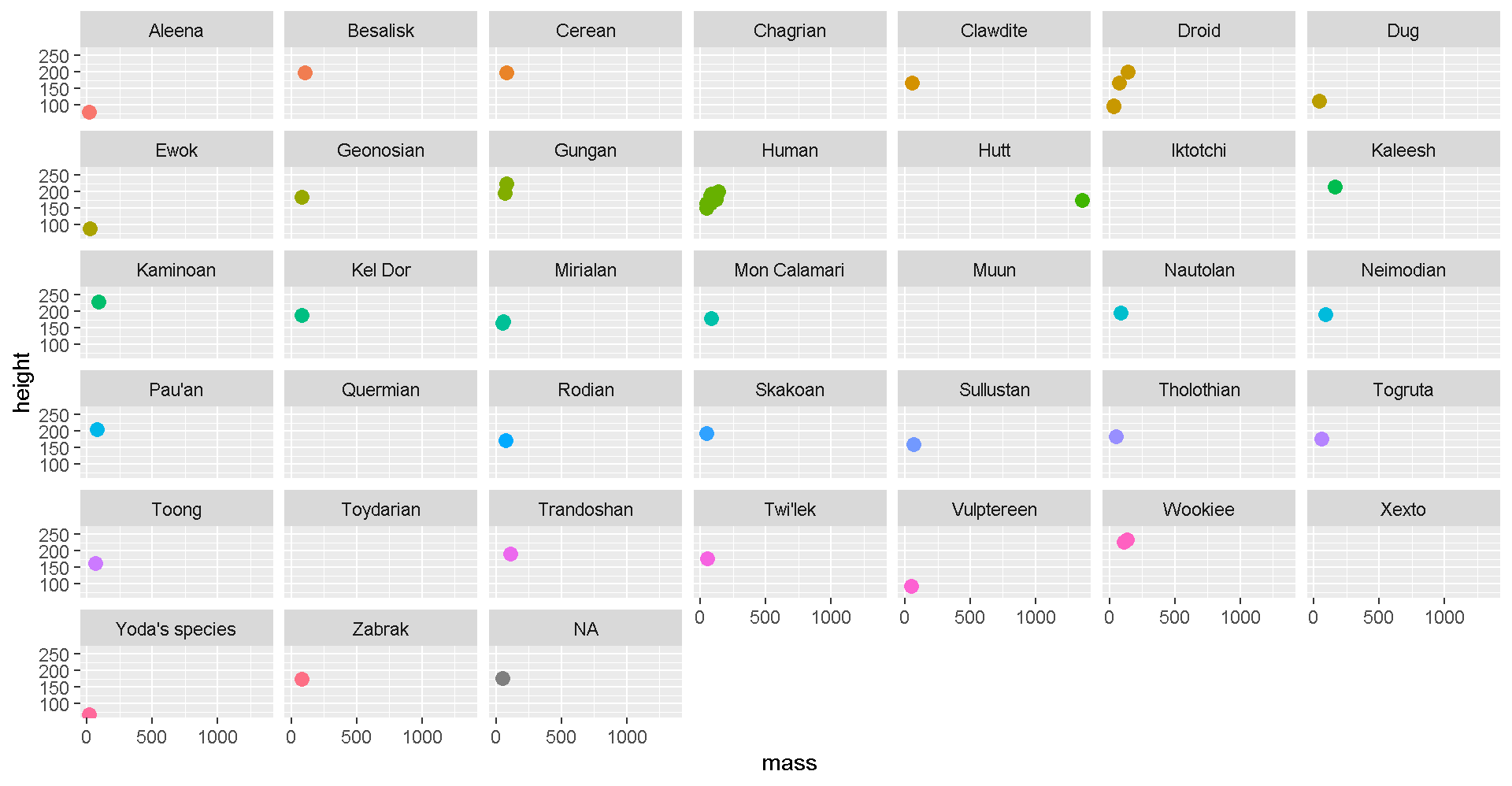
AQS format
BONUS Save to AQS format
AQS format is similar to a CSV, but instead of a , it uses the | to separate values. Oh, and we also need to have 28 columns. But don’t worry, most of them are blank.
# Load packages
library(readr)
library(dplyr)
library(janitor)
library(lubridate)
library(stringr)

# Columns names in AQS
aqs_columns <-  c("Transaction Type", "Action Indicator", "State Code",
                  "County Code", "Site Number", "Parameter",
                  "POC", "Duration Code", "Reported Unit",
                  "Method Code", "Sample Date", "Sample Begin Time",
                  "Reported Sample Value", "Null Data Code", "Collection Frequency Code",
                  "Monitor Protocol ID", "Qualifier Code - 1", "Qualifier Code - 2",
                  "Qualifier Code - 3", "Qualifier Code - 4", "Qualifier Code - 5",
                  "Qualifier Code - 6", "Qualifier Code - 7", "Qualifier Code - 8",
                  "Qualifier Code - 9", "Qualifier Code - 10", "Alternate Method Detection Limit",
                  "Uncertainty Value")

# Read in raw monitoring data
my_data <- read_csv("https://itep-r.netlify.com/data/ozone_samples.csv")


# Sad only 2 columns version
# my_data <- read_csv("https://itep-r.netlify.com/data/aqs/aqs_start.csv")


# Read AQS file
# my_data <- read_delim("https://itep-r.netlify.com/data/aqs/air_export_44201_080218.txt", delim = "|", col_names = F, trim_ws = T)

# Clean the names
my_data <- clean_names(my_data)

# View the column names
names(my_data)

# Format the date column
# Date is in year-month-day format, use "ymd_hms()"
my_data <- mutate(my_data, date_time = ymd_hms(date_time),
                           cal_date  = date(date_time))

# Remove dashes from the date, EPA hates dashes
my_data <- mutate(my_data, cal_date = str_replace_all(cal_date, "-", ""))

# Add hour column
my_data <- mutate(my_data, hour = hour(date_time),
                           time = paste(hour, ":00"))

# Create additional columns
my_data <- mutate(my_data,
                   state     = substr(site, 1, 2),
                   county    = substr(site, 4, 6),
                   site_num  = substr(site, 8, 11),
                   parameter = "44201",
                   poc       = 1,
                   units     = "007",
                   method    = "003",
                   duration  = "1",
                   null_data_code = "",
                   collection_frequency = "S",
                   monitor = "TRIBAL",
                   qual_1 = "",
                   qual_2 = "",
                   qual_3 = "",
                   qual_4 = "",
                   qual_5 = "",
                   qual_6 = "",
                   qual_7 = "",
                   qual_8 = "",
                   qual_9 = "",
                   qual_10 = "",
                   alt_meth_det = "",
                   uncertain = "",
                   transaction = "RD",
                   action = "I")

# Put the columns in AQS order
my_data <- select(my_data,
                   transaction, action, state, county,
                   site_num, parameter, poc, duration,
                   units, method, cal_date, time, ozone,
                   null_data_code, collection_frequency,
                   monitor, qual_1, qual_2, qual_3, qual_4,
                   qual_5, qual_6, qual_7, qual_8, qual_9,
                   qual_10, alt_meth_det, uncertain)

# Set the names to AQS
names(my_data) <- aqs_columns

# Save to a "|" separated file
write_delim(my_data, "2015_AQS_formatted_ozone.txt",
            delim        = "|",
            quote_escape = FALSE)

# Read file back in
aqs <- read_delim("2015_AQS_formatted_ozone.txt", delim = "|")
Share with friends

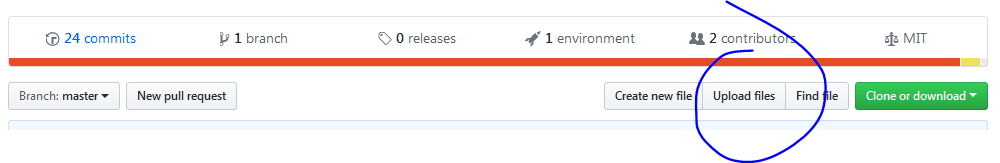
Add a new repository
Now we can create a new repository to store some of our new R plots and scripts. Click the bright green New button to get started.
- Give it a short name like
Rplots - Keep it public
- [x] Check the box to initialize with a README
- Click
[ Create repository ]
Add a plot
Click Upload files to add an image of an R plot or one of your scripts as an .R file.
Back to Earth
You’re free! Go ahead and return to Earth: frolic in the grass, jump in a lake. Now that we’re back, let’s look at some data to get fully reacclimated.
Choose one of the data exercises below to begin.
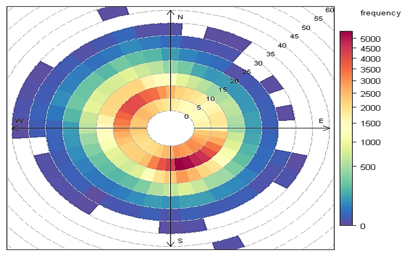
Explore the connection between wind direction, wind speed, and pollution concentrations near Fond du Lac. Make a wind rose and then a pollution rose, two of my favorite flowers.
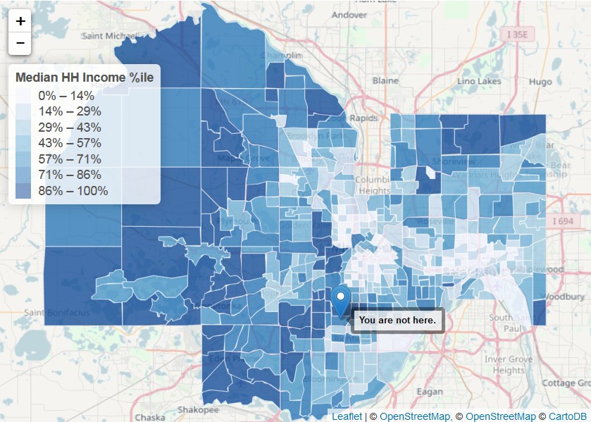
Study the housing habits of Earthlings. Create interactive maps showing the spatial clustering of different social characteristics of the human species.
Start with messy wide data and transform into a tidy table ready for easy plotting, summarizing, and comparing. For the grand finale, read an entire folder of files into 1 table.
Media: air
Planet: Earth
Media: social-human
Planet: Earth
Media: air
Planet: Earth