Let’s take a look at some air pollution data stored in an Excel file.
Download the data
DOWNLOAD — La Jolla PM25 data
Install packages
# Get devtools for installing new packages from GitHub
install.packages("devtools", dependencies = TRUE)

# Load the devtools library
library(devtools)

# Install openair for windrose functions
install_github('davidcarslaw/openair')
Load the data
# Load packages
library(openair)
library(readxl)
library(ggplot2)
library(dplyr)
library(lubridate)

# Set the path to your the Excel file
excel_path <- "data/la_jolla_pm25_wind_data.xls"
# Read the file
air_data <- read_excel(excel_path)Explore the data
What are the column names?
names(air_data)

glimpse(air_data)

summary(air_data)
Simplify the column names
# Drop special characters and shorten names
# Set all names to lowercase
air_data <- air_data %>%
            rename(pm25 = "PM2.5 Conc (ug/m3)",
                   wd   = "Wind Direction (Degrees)",
                   ws   = "Wind Speed (mph)") %>%
            rename_all(tolower)

# We need numbers for our data, not text
# Set wind speed and wind direction to numeric
air_data <- air_data %>%
            mutate(wd   = as.numeric(wd),
                   ws   = as.numeric(ws))
## Warning: NAs introduced by coercionPlot the data
Create a plot to show the distribution of each of the columns containing observations: wind speed, wind direction, and concentration.
ggplot(air_data, aes(x = ?, y = ?)) + geom_point()Clean ship
Let’s drop the non-sense values. We can’t use the rows that have a missing windspeed or wind direction observation.
air_data <- filter(air_data,
                   !is.na(ws),
                   !is.na(wd),
                   !is.na(pm25),
                   ws > 0)
Wind rose
Now let’s make some wind roses.
# Plot the data
windRose(air_data)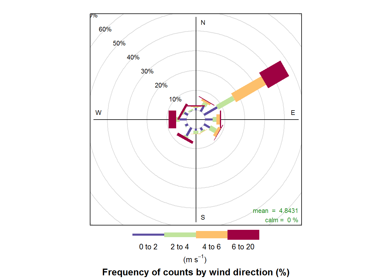
polarFreq(air_data)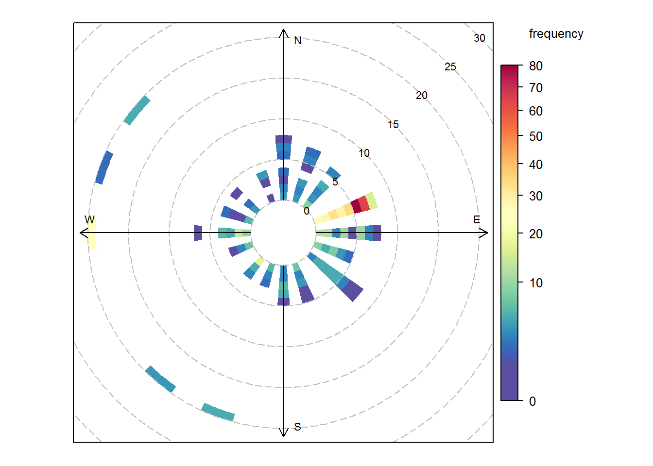
#-- Fine tune  wind rose
polarFreq(air_data, ws.int =5, ws.upper = 35)

polarFreq(air_data, ws.int =0.8, breaks = seq(2:30))
Pollution rose
To make a pollution rose we can replace the name of the wind speed column with the name of PM2.5 column - "PM2.5 Conc (ug/m3)"
# Pollution concentrations based on wind directions
pollutionRose(air_data,
              pollutant = "pm25",
              key.footer = "PM2.5 ug/m3")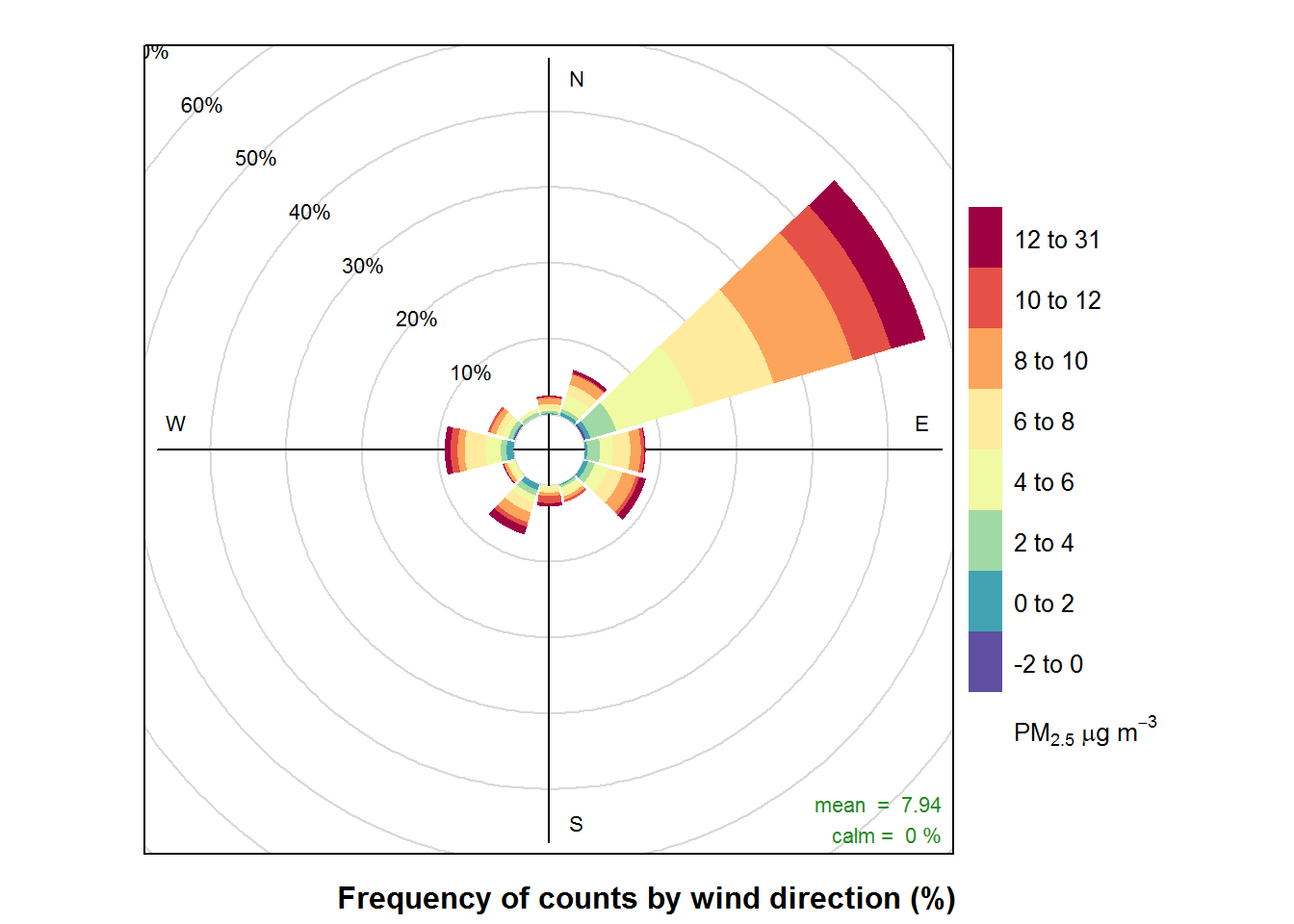
Time series
DOWNLOAD — Ozone air data
library(lubridate)
library(readr)
library(ggplot2)

# Read the file
excel_path <- "data/2014_AQS_FondduLac.xlsx"

air_data <- read_excel(excel_path)
## # A tibble: 5 x 12
## StateCode CountyCode SiteNum Latitude Longitude Date
## <dbl> <dbl> <dbl> <dbl> <dbl> <dttm>
## 1 27 137 7001 47.5 -92.5 2014-01-01 00:00:00
## 2 27 137 7001 47.5 -92.5 2014-01-01 00:00:00
## 3 27 137 7001 47.5 -92.5 2014-01-01 00:00:00
## 4 27 137 7001 47.5 -92.5 2014-01-01 00:00:00
## 5 27 137 7001 47.5 -92.5 2014-01-01 00:00:00
## # ... with 6 more variables: Time <dttm>, Hour <dbl>, Parameter <dbl>,
## # Conc <dbl>, site_catid <chr>, Year <dbl>Explore the data
names(air_data)

glimpse(air_data)
Simplify the column names
# Set all names to lowercase
air_data <- air_data %>%
            rename_all(tolower) %>%
            rename(site = site_catid)
Let’s focus on PM2.5
Use filter to select only the parameter code 88101.
air_data <- filter(air_data, parameter == ??)air_data <- filter(air_data, parameter == 88101)Let’s summarize the observations by day and then make a time series chart to see how the pollution concentrations are changing over time.
Add monthly statistics
# Add a month column
air_data <- air_data %>%
            mutate(day   = day(date),
                   month = month(date),
                   year  = year(date))


# Find average PM25 concentration for each day
#   - And upper and lower 10th percentile concentration
air_summary <- group_by(air_data, site, year, month, day, date) %>%
               summarize(conc_avg  = mean(conc, na.rm = T),
                         conc_10th = quantile(conc, 0.10, na.rm = T),
                         conc_90th = quantile(conc, 0.90, na.rm = T)) %>%
               ungroup()
Plot a line chart
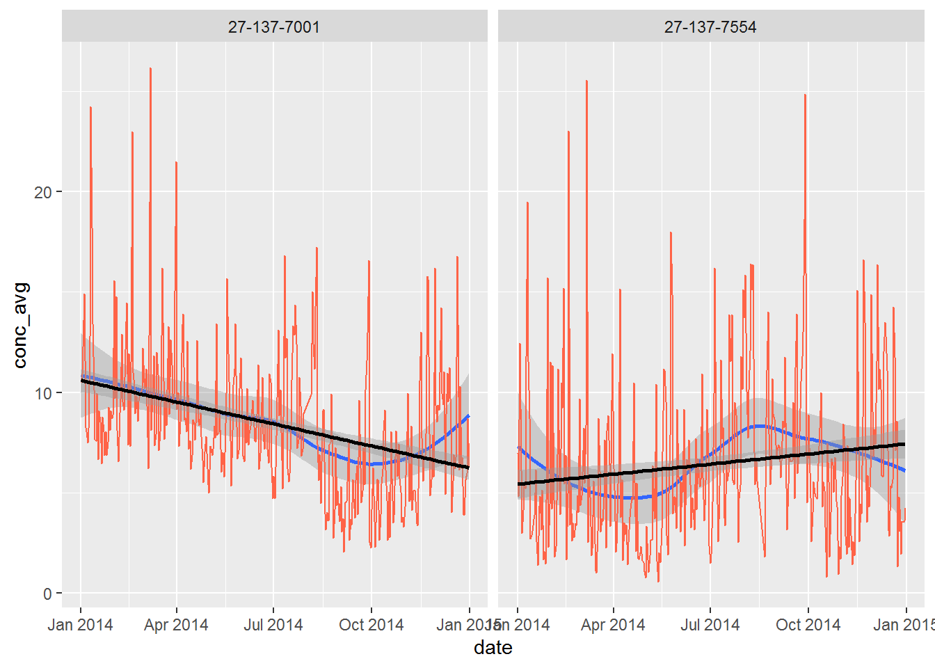
ggplot(air_summary, aes(x = date, y = conc_avg)) +
   geom_line() +
   facet_wrap(~ site)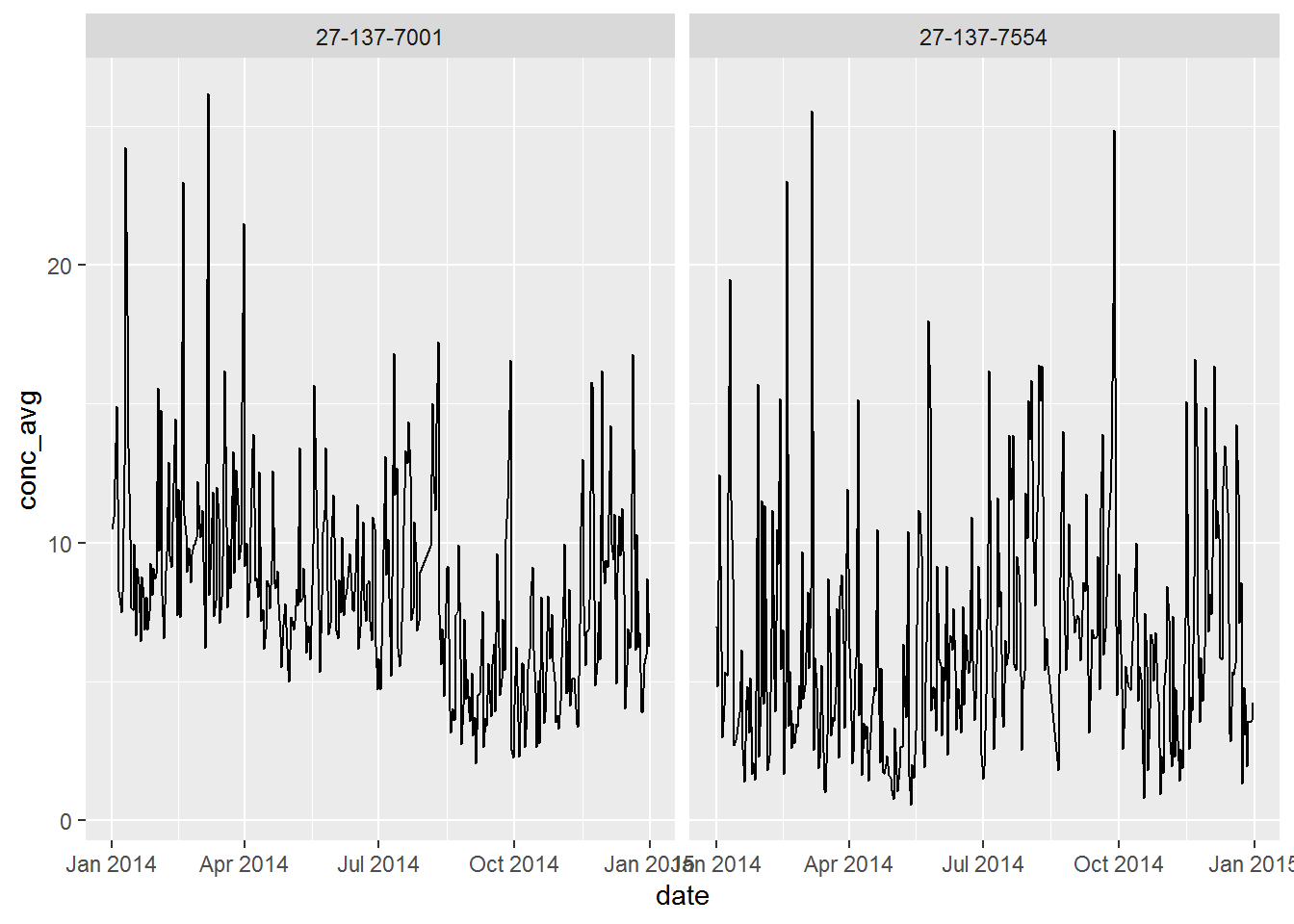
Now we can add a confidence band behind the line showing the upper and lower 10th percentile of the observations.
ggplot(air_summary, aes(x = date, y = conc_avg)) +
   geom_smooth(method ="loess", level = 0.90) +
   geom_line(color = "tomato") +
   facet_wrap(~site)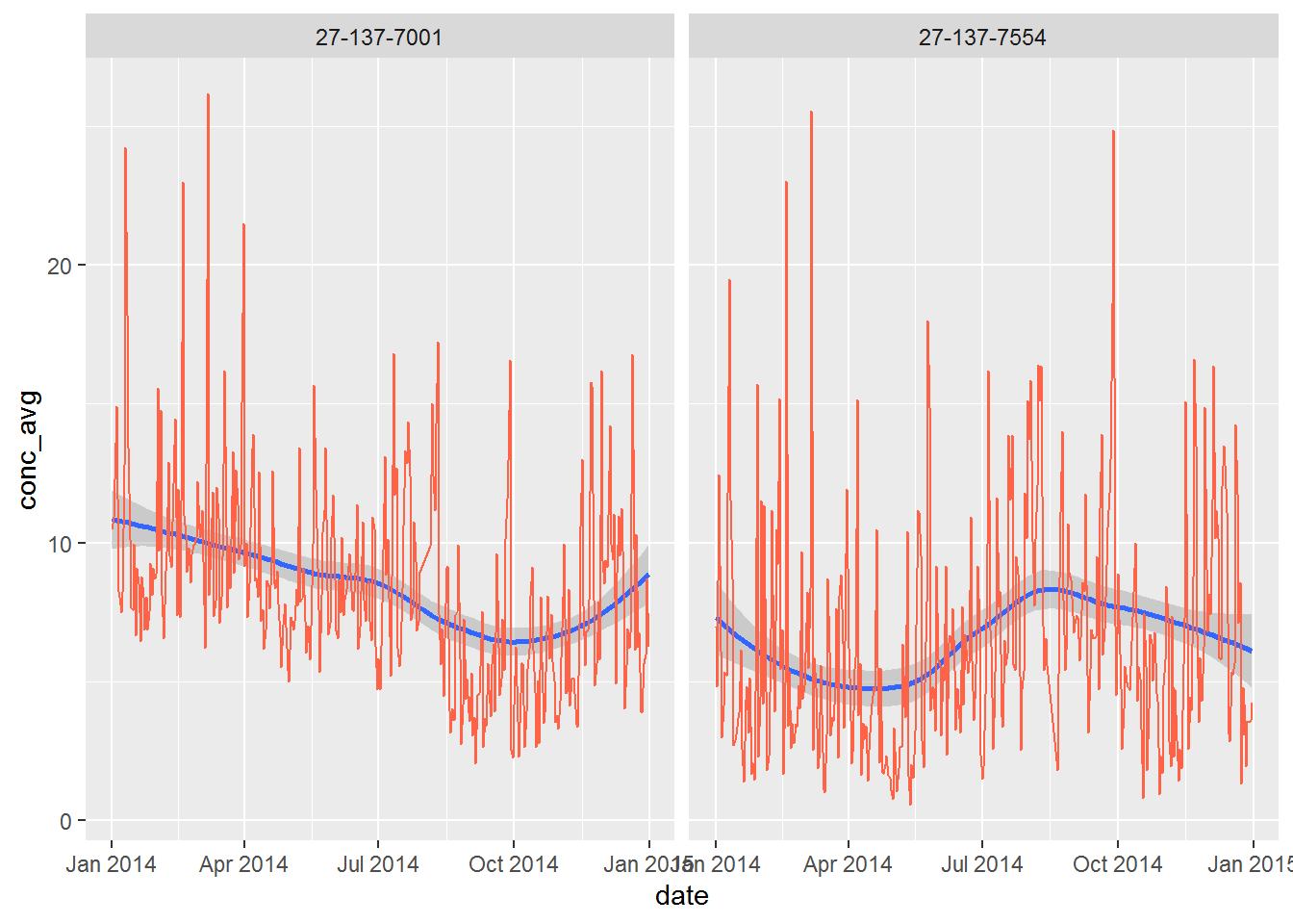
What happens when you increase the level = 0.90 up to 0.999, making the shaded band a 99% confidence interval?
Try adding another confidence band, but make it a linear model: method = "lm", and set the color to “black”. Does the new line predict the concentration to be going down or up at each site?
ggplot(air_summary, aes(x = date, y = conc_avg)) +
   geom_smooth(method = "loess", level = 0.999) +
   geom_line(color = "tomato") +
   geom_smooth(method = "lm", level = 0.90, color = "black") +
   facet_wrap(~site)