- Introductions
- Why R?
- RStudio - The grand tour
- First steps
- 1. | Read the data
- 2. | Plot the data
- 3. | Explore the data
- 4. | Clean the data
- Porgs to the rescue!
- ☕
Lunch break - Dates
- Guess Who?
- 5. | More plots!
- Combine tables with
left_join() - 6. | Group and Summarize the data
- 7. | Save results
- 8. | Share with friends
- Help!
- Customize R Studio
Welcome!

Power on your droids
You and BB8 have arrived just in time. Rey needs your help!
Rey has to travel to Tatooine, but years of scrapping ship parts hasn’t been kind to her lungs. Using past pollution levels, let’s find the best month for Rey to visit the dusty surface of Tatooine.
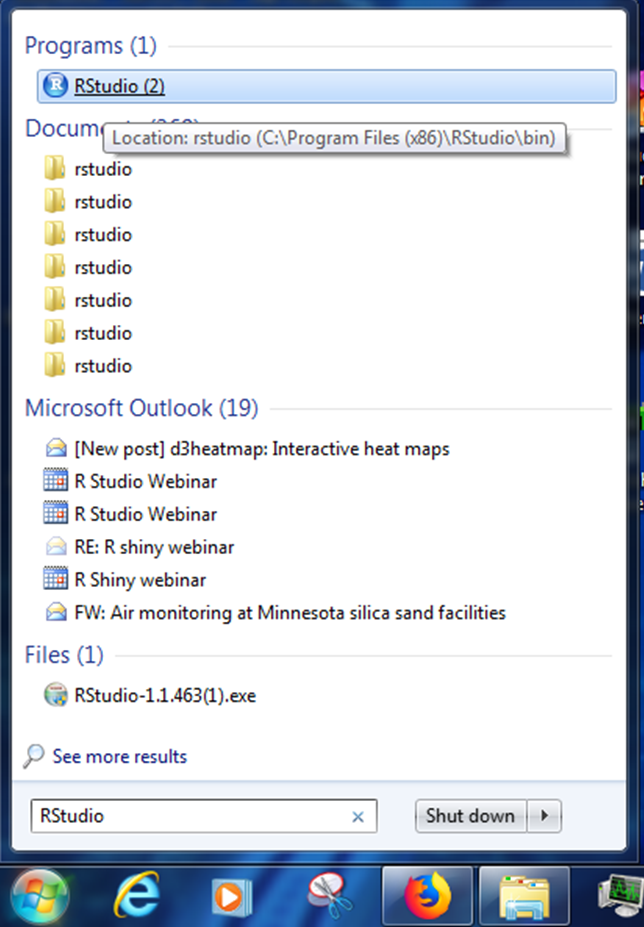
Open RStudio
- Where’s my R! Need to install R or RStudio? Jump over to Get R!
- Install troubles? No permissions? No worries. You can use R online at RStudio Cloud.
Introductions
Good morning!
We are Melinda, Vallen, Jaime, Kristie & Dorian.
We like R.
We aren’t computer scientists and that’s okay!
We make lots of mistakes. Mistakes are funny. You can laugh with us.
All together now
Let’s launch ourselves into the unknown and use R to store some data. We’re going to use R to introduce a friend and the data they love. Find a partner and learn 3 things about them.

Things to Share
- Your name
- How far you traveled to here
- Types of air data you have
- Something you hope to use R for
- A favorite snack
- How many pets you have
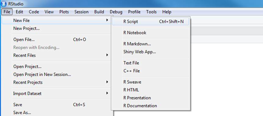
- In R Studio click on File > New File > R Script. You will see a code editor window open.
- You will be writing and saving code in this window. This is your code editor.
Create and store values
You can assign values to new objects using the “left arrow”, which is written as <-.
Left arrow
x <- 5
This is typed using a less-than sign followed by a hyphen. It’s more officially known as the assignment operator. Try adding the code below to your R script and assign a value to an object called partner.
Create values
my_partner <- "Partner's Name" # Text and characters are put in quotes

miles_traveled <- 1160 # A number has no quotes

# A list of data I use
data_types <- c("PAHs", "Ozone", "Fine particles")

best_snack_ever_99 <- "Air Heads"
View values
Now you can type partner and run that line to see the value stored in that variable.
my_partner## [1] "Partner's Name"Copy values
nickname <- my_partner

nickname
Drop and remove data
You can drop objects with the remove function rm(). Try it out on some of your objects.
# Delete objects to clean-up your environment
rm(nickname)
EXERCISE!
How can we get the ‘nickname’ object back?
HINT: The UP arrow in the Console is your friend.
To run everything in one go, highlight all of the code in the Code Editor and push
CTRL+ENTER.
It’s ALL about you
Now we can create a data table, which in R is also called a data.frame or a tibble. When creating one, the column names go on the left, and the values you want to put in the column go on the right.
# Put the items into a table
all_about_you <- data.frame(name           = my_partner,
                            miles_traveled = miles_traveled,
                            data_types     = data_types,
                            best_snack     = best_snack_ever_99)
Let’s bounce around the room and introduce ourselves with help from our new data frames.
GET R PACKAGES
To use a new package in R you first need to install it – much like a free App on your phone. To save time on installation, you can copy the text below and paste it into the RStudio Console. It’s the quadrant on the lower left when you open RStudio. The one with the > symbols.
new_packages <- c("readr", "readxl", "dplyr", "stringr",
                  "ggplot2", "lubridate", "janitor", "curl")

install.packages(new_packages)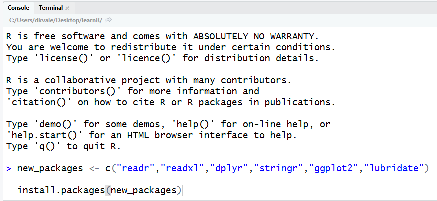
Then press ENTER to begin the installation. If all goes well, you should start to see some messages appear similar to these:
Congrats rebel droid!
Why R?
R Community
- See the R Community page.
- ITEP page for sharing & questions - R questions
- Finding R Help - Get help!
- R cheatsheets
When do we use R?
- To connect to databases
- To read data from websites
- To document and share methods
- When data will have frequent updates
- When we want to improve a process over time
R is for reading
Lucky for us, programming doesn’t have to be a bunch of math equations. R allows you to write your data analysis in a step-by-step fashion, much like creating a recipe for cookies. And just like a recipe, we can start at the top and read our way down to the bottom.
It begins!
Today’s challenge

Rey needs to visit Tatooine to help the Rebel Alliance, and we have ozone data to help her decide what month she should visit. Preferably the month with the lowest ozone concentrations. Let’s make a nice reference chart of monthly ozone concentrations to help her plan.
We’ll follow the general roadmap below.
Today’s workflow
- READ the data
- PLOT the data
- CLEAN the data
- ( PLOT some more )
- SUMMARIZE the data
- ( PLOT even more )
- SAVE the results
- SHARE with friends
Start an R project
We’ll make a new project for our investigation of ozone on Tatooine.
Step 1: Start a new project
- In Rstudio select File from the top menu bar
- Choose New Project…
- Choose New Directory
- Choose New Project
- Enter a project name such as
"NTF_2019" - Select Browse… and choose a folder where you normally perform your work.
- Click Create Project
Step 2: Open a new script
- File > New File > R Script
- Click the floppy disk save icon
- Give it a name:
ozone.Rwill work well
RStudio - The grand tour
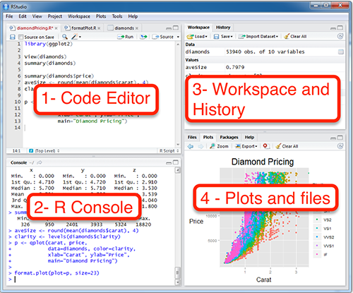
1. Code Editor
This is where you write your scripts and document your work. The tabs at the top of the code editor allow you to view scripts and data sets you have open. This is where you’ll spend most of your time.
2. Console
This is where code is executed by the computer. It shows code that you have run and any errors, warnings, or other messages resulting from that code. You can input code directly into the console and run it, but it won’t be saved for later. That’s why we like to run all of our code directly from a script in the code editor.
3. Workspace
This pane shows all of the objects and functions that you have created, as well as a history of the code you have run during your current session. The environment tab shows all of your objects and functions. The history tab shows the code you have run. Note the broom icon below the Connections tab. This cleans shop and allows you to clear all of the objects in your workspace.
4. Plots and files
These tabs allow you to view and open files in your current directory, view plots and other visual objects like maps, view your installed packages and their functions, and access the help window. If at anytime you’re unsure what a function does, enter it’s name after a question mark. For example, try entering ?mean into the console and push ENTER.
First steps
1. | Read the data

#install.packages("readr")
library(readr)

air_data <- read_csv("https://itep-r.netlify.com/data/ozone_samples.csv")| DateTime | SITE | OZONE | LATITUDE | LONGITUDE | TEMP_F | UNITS |
|---|---|---|---|---|---|---|
| 2015-04-06 20:00:00 | 27-017-7417 | 0.043 | 46.71369 | -92.51172 | 36.19 | PPM |
| 2015-08-21 08:00:00 | 27-017-7417 | 0.010 | 46.71369 | -92.51172 | 51.41 | PPM |
| 2015-10-23 05:00:00 | 27-017-7417 | 0.019 | 46.71369 | -92.51172 | 43.06 | PPM |
| 2014-10-21 06:00:00 | 27-137-7001 | 0.000 | 47.52336 | -92.53630 | 42.50 | PPM |
| 2015-12-17 17:00:00 | 27-017-7417 | 0.020 | 46.71369 | -92.51172 | 23.53 | PPM |
Clean header names


There are two great packages that can help us with cleaning header names. Let’s install them!
Install new packages
install.packages("janitor")
install.packages("dplyr")
Load packages from your personal library()
library(janitor)
library(dplyr)

# General cleaning for all columns
air_data <- clean_names(air_data)

# Change and set specific names
air_data <- rename(air_data,
                   lat = latitude,
                   lon = longitude)
View the new names
names(air_data)## [1] "date_time" "site" "ozone" "lat" "lon" "temp_f"
## [7] "units"2. | Plot the data
Plot the data, Plot the data, Plot the data
#install.packages("ggplot2")
library(ggplot2)

ggplot(air_data, aes(x = temp_f, y = ozone, color = site)) +
geom_point(size = 7, alpha = 0.3) 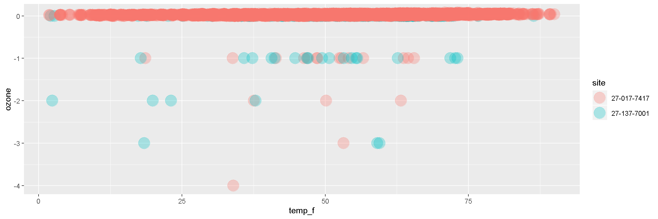
Break it down now
The ggplot() sandwich

A ggplot has 3 ingredients.
1. The base plot
library(ggplot2)ggplot(air_data)
2. The the X, Y aesthetics
The aesthetics assign the components from the data that you want to use in the chart. These also determine the dimensions of the plot.
ggplot(air_data, aes(x = temp_f, y = ozone)) 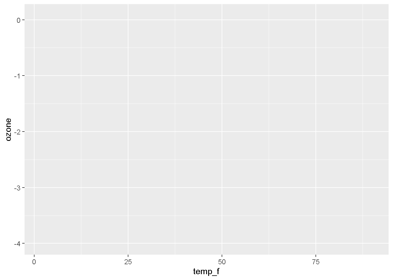
3. The layers or geometries
ggplot(air_data, aes(x = temp_f, y = ozone)) + geom_point()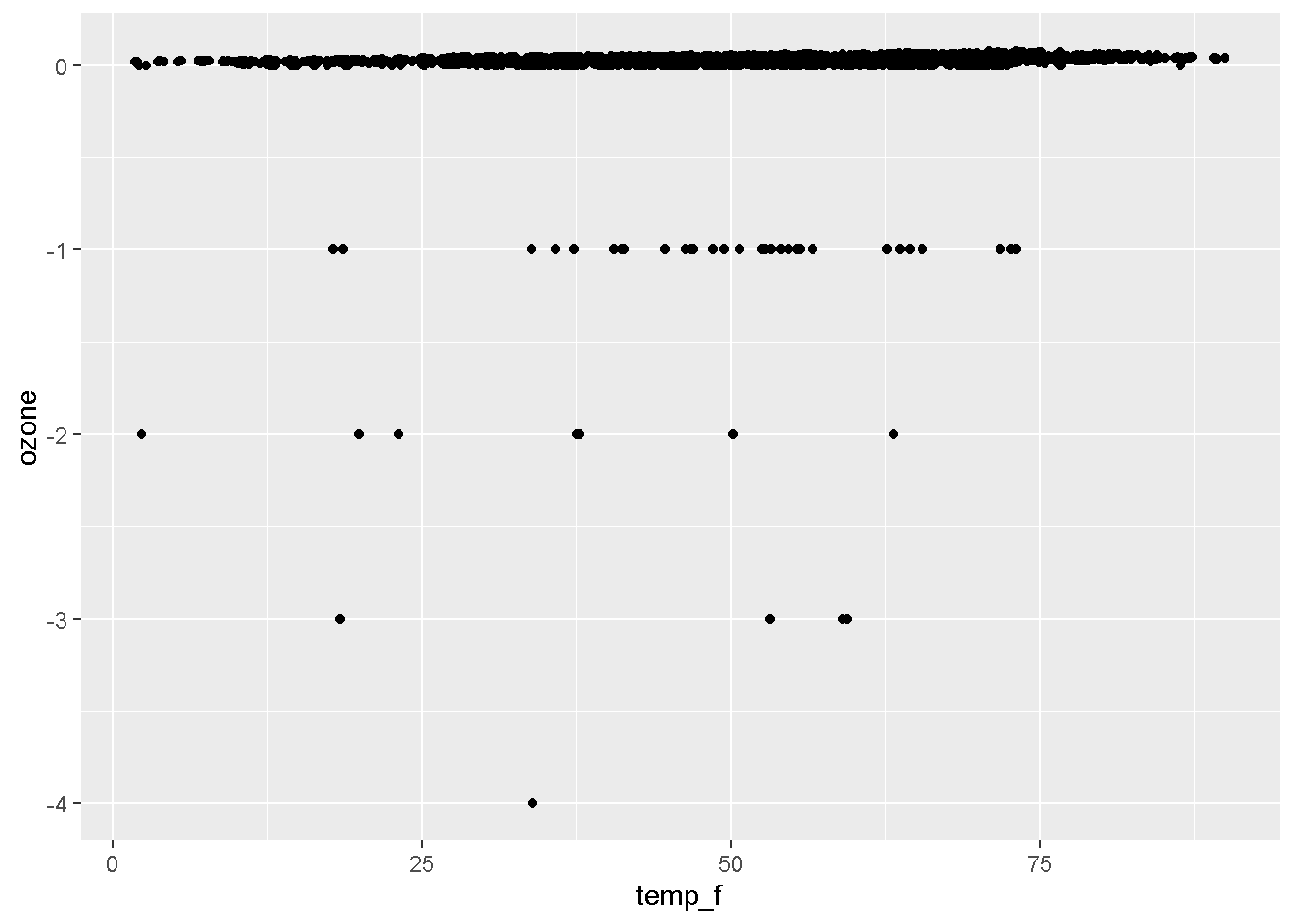
EXERCISE
Try making a scatterplot of any two columns. Here’s a template to get you started.
ggplot(air_data, aes(x = column1, y = column2 )) + geom_point()Hint: Numeric variables will be more exciting.
NOTE
We load the package
library (ggplot2), but the function to make a plot isggplot(scrap).
3. | Explore the data
Some functions to get to know your data.
| Function | Information |
|---|---|
names(air_data) |
column names |
nrow(...) |
number of rows |
ncol(...) |
number of columns |
summary(...) |
a summary of all column values (ex. max, mean, median) |
glimpse(...) |
column names + a glimpse of first values (use dplyr package) |
glimpse() and summary()
Use the glimpse() function to find out what type and how much data you have.
library(dplyr)

# Glimpse the columns of your data and their first few contents
glimpse(air_data)
## Observations: 6,665
## Variables: 7
## $ date_time <dttm> 2015-07-06 09:00:00, 2015-07-13 04:00:00, 2015-07-1...
## $ site <chr> "27-017-7417", "27-017-7417", "27-017-7417", "27-017...
## $ ozone <dbl> 0, -1, -2, 0, 0, 0, 0, 0, 0, 0, -1, 0, -1, -1, -1, 0...
## $ lat <dbl> 46.71369, 46.71369, 46.71369, 46.71369, 46.71369, 46...
## $ lon <dbl> -92.51172, -92.51172, -92.51172, -92.51172, -92.5117...
## $ temp_f <dbl> 64.36, 64.49, 63.23, 61.49, 61.30, 71.22, 76.63, 64....
## $ units <chr> "PPM", "PPM", "PPM", "PPM", "PPM", "PPM", "PPM", "PP...Use the summary() function to get a quick report of your numeric data.
# Show numeric summary of the min, mean, and max of all columns
summary(air_data)
## date_time site ozone
## Min. :2014-04-03 03:00:00 Length:6665 Min. :-4.00000
## 1st Qu.:2015-06-07 10:00:00 Class :character 1st Qu.: 0.01700
## Median :2015-08-16 20:00:00 Mode :character Median : 0.02500
## Mean :2015-08-13 15:04:35 Mean : 0.01666
## 3rd Qu.:2015-10-24 12:00:00 3rd Qu.: 0.03500
## Max. :2016-01-01 05:00:00 Max. : 0.07500
## lat lon temp_f units
## Min. :46.71 Min. :-92.54 Min. : 1.83 Length:6665
## 1st Qu.:46.71 1st Qu.:-92.51 1st Qu.:37.85 Class :character
## Median :46.71 Median :-92.51 Median :52.32 Mode :character
## Mean :46.73 Mean :-92.51 Mean :50.85
## 3rd Qu.:46.71 3rd Qu.:-92.51 3rd Qu.:63.59
## Max. :47.52 Max. :-92.51 Max. :90.01Try running some of these in your script.
nrow(air_data)

ncol()

names()
4. | Clean the data
It’s time for dplyr
This is our go-to package for most analysis tasks. With the six functions below you can accomplish just about anything you want.
Your new analysis toolbox
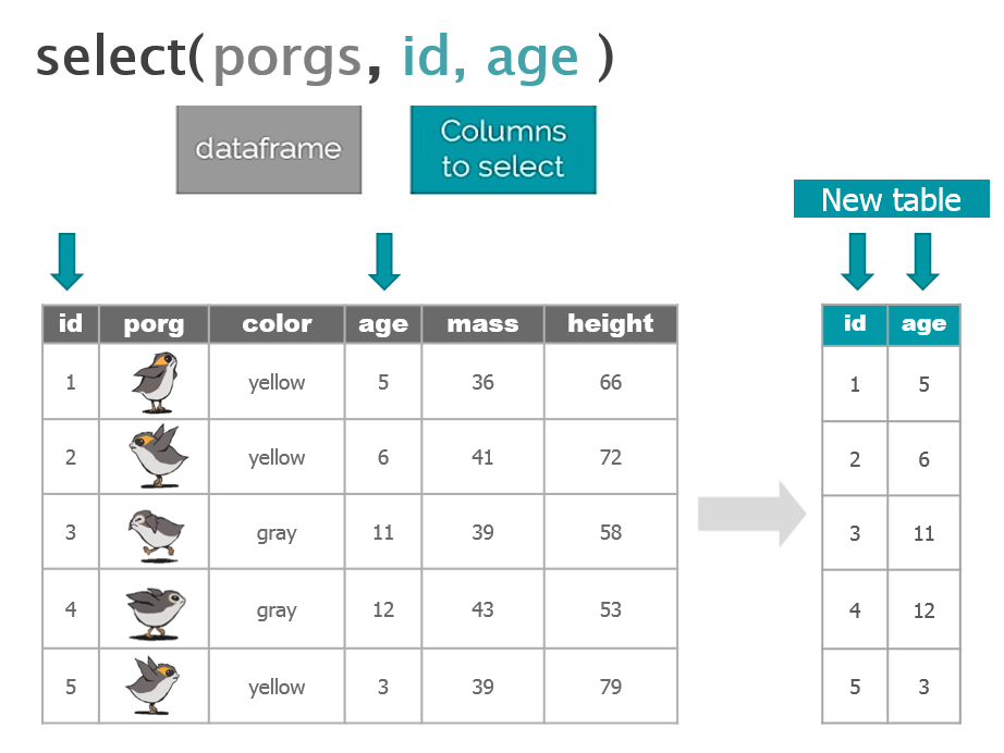
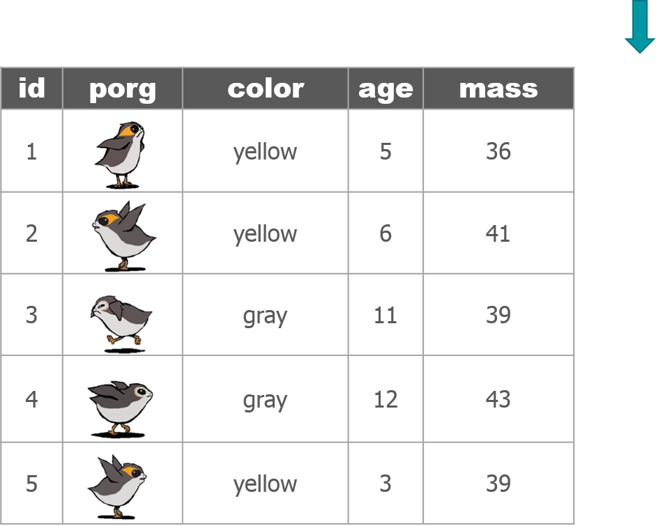
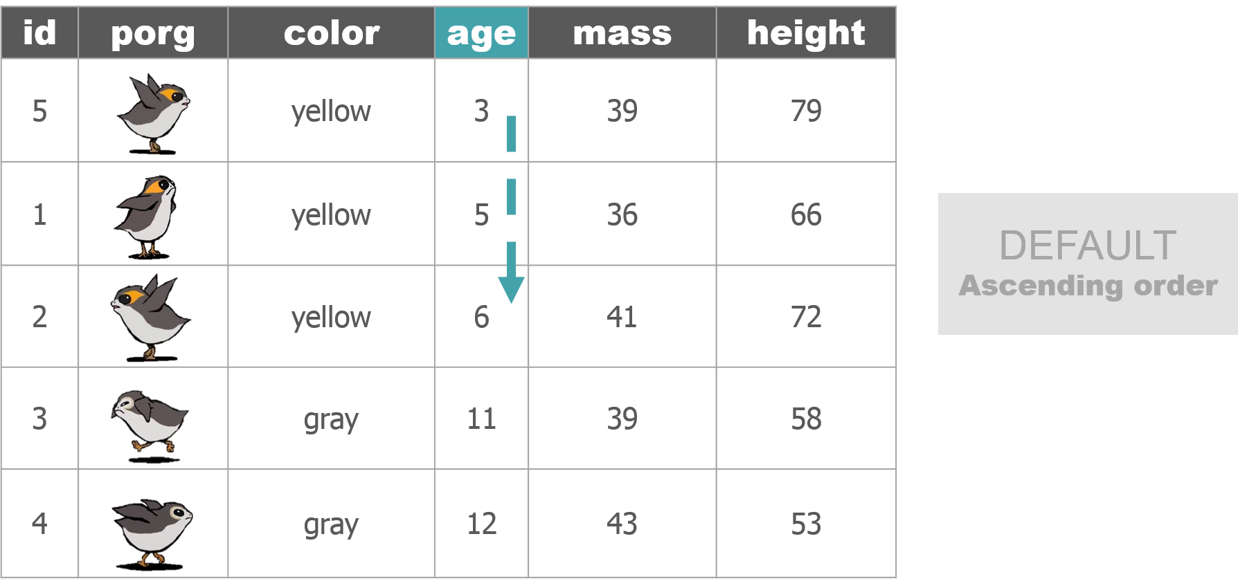
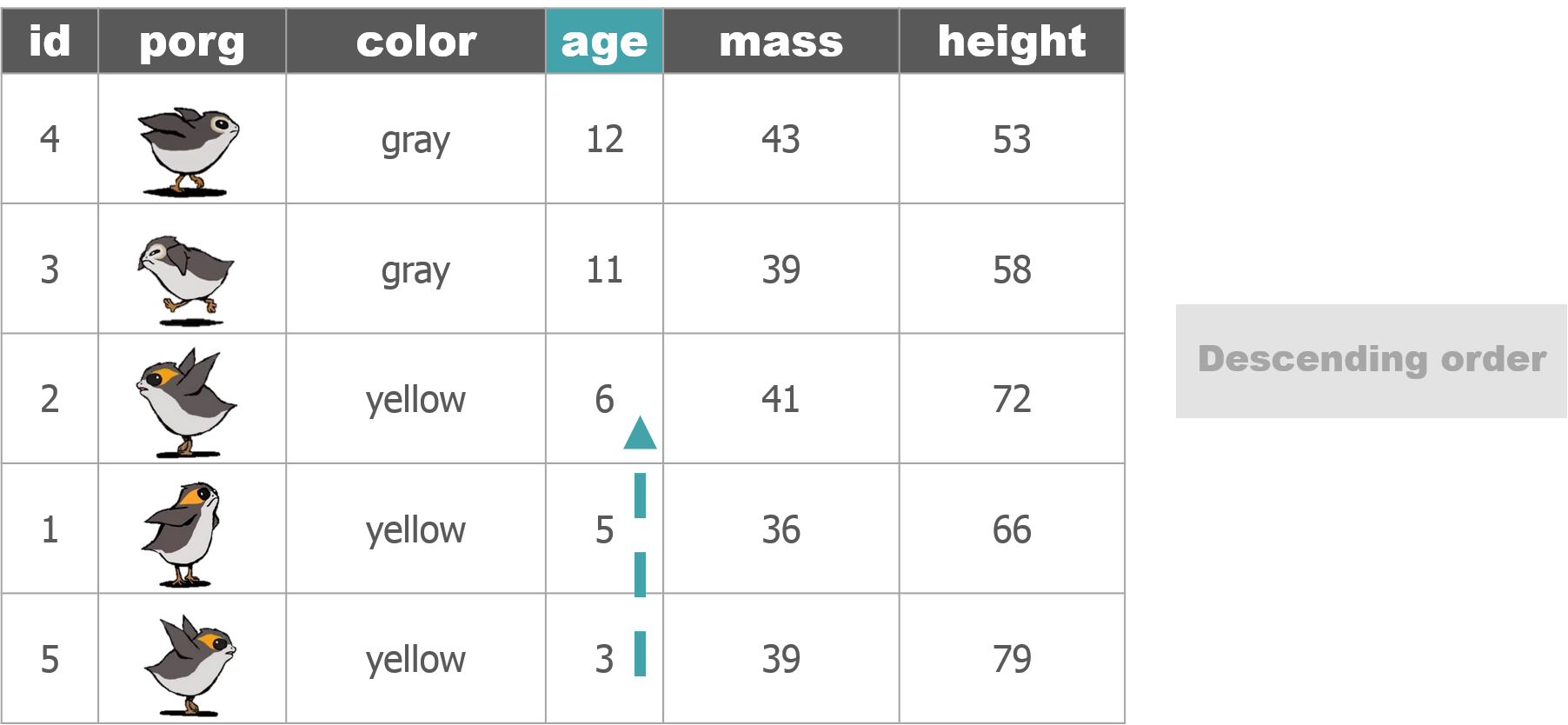
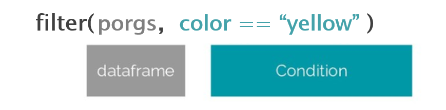
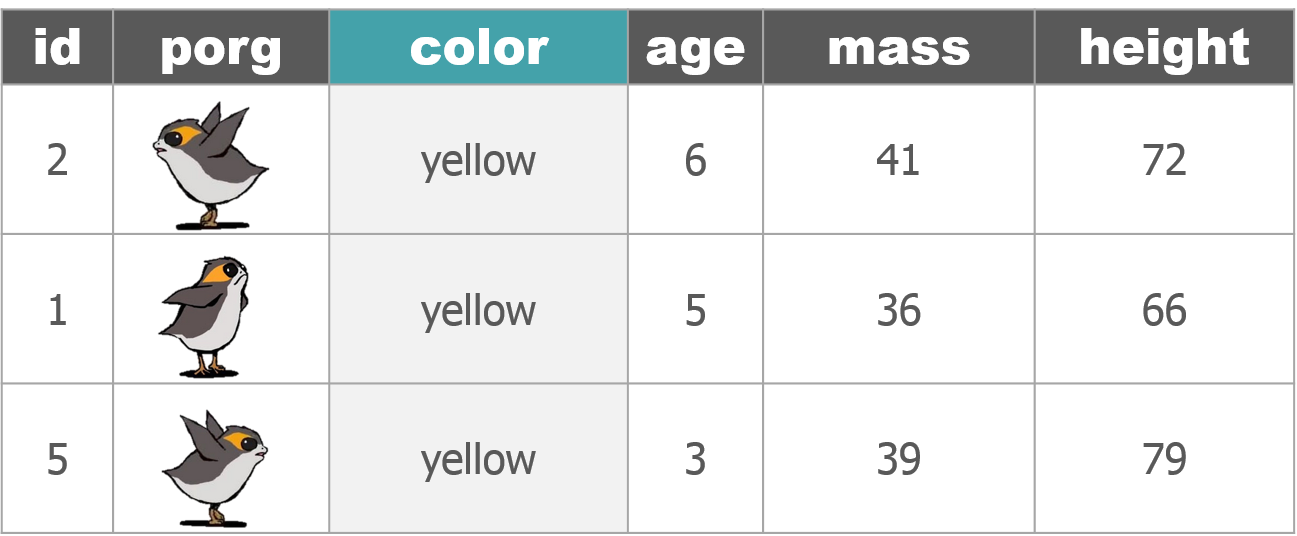
Function Job select()Select individual columns to drop or keep arrange()Sort a table top-to-bottom based on the values of a column filter()Keep only a subset of rows depending on the values of a column mutate()Add new columns or update existing columns summarize()Calculate a single summary for an entire table group_by()Sort data into groups based on the values of a column
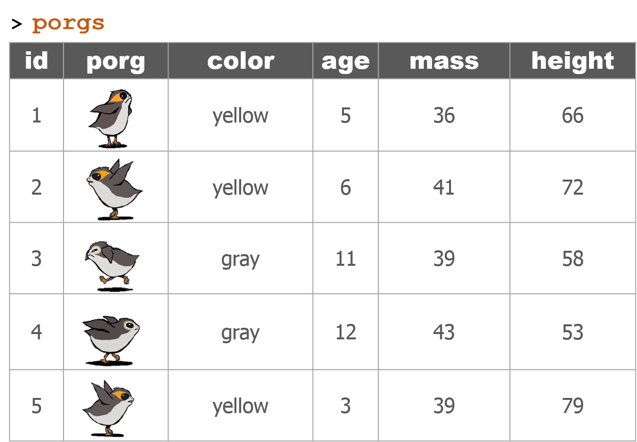
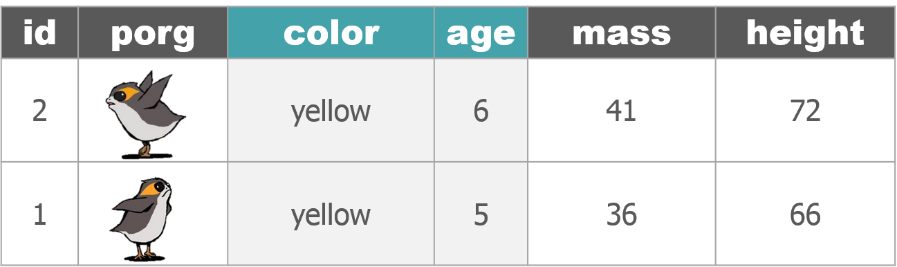
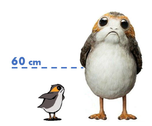
Porgs to the rescue!
We recruited a poggle of porgs to help demo the dplyr functions. There are two types of porgs: yellow-eyed and gray-eyed.


Back to the ozone data…
Filter out values that are out-of-range
# Drop values out of range
air_data <- filter(air_data, ozone > 0)

# We can filter with two conditions
air_data <- filter(air_data, ozone > 0, temp_f < 199)
Show distinct() values
Show the unique values in the site and units column
# Show all unique values in the site column
distinct(air_data, site)
## # A tibble: 1 x 1
## site
## <chr>
## 1 27-017-7417# Show all unique values in the units column
distinct(air_data, units)## # A tibble: 1 x 1
## units
## <chr>
## 1 PPMPPM? That explains the tiny results. Let’s convert to PPB. For that we’ll want our friend the mutate function.
Convert units
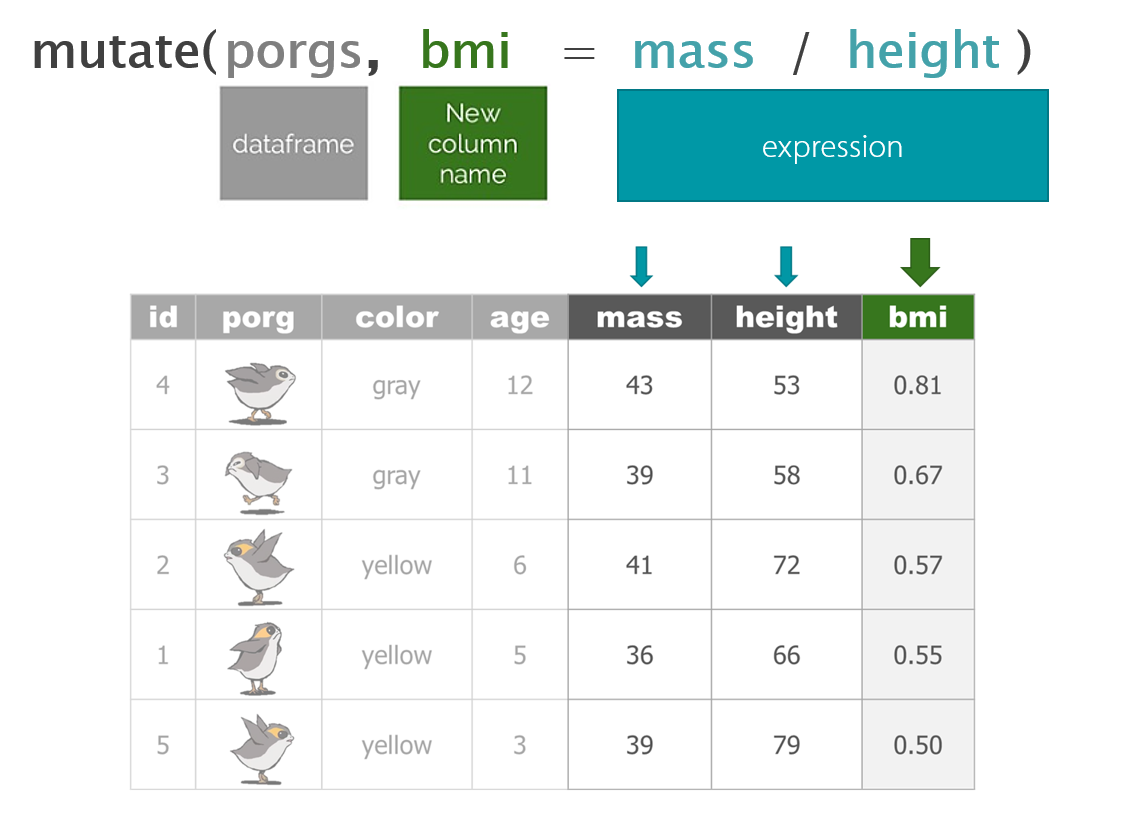
mutate()
For mutate, the name of the column goes on the left, and the calculation of its new value goes on the right.
Update the column ozone
# Convert all samples to PPB
air_data <- mutate(air_data, ozone = ozone * 1000)
Update the column units
# Set units column to PPB
air_data <- mutate(air_data, units = "PPB") 
☕ Lunch break
Dates
The lubridate package

It’s about time! Lubridate makes working with dates easier. We can find how much time has elapsed, add or subtract days, and aggregate to seasonal, monthly, or day of the week averages.
Convert text to a DATE
| Function | Order of date elements |
|---|---|
mdy() |
Month-Day-Year :: 05-18-2019 or 05/18/2019 |
dmy() |
Day-Month-Year (Euro dates) :: 18-05-2019 or 18/05/2019 |
ymd() |
Year-Month-Day (science dates) :: 2019-05-18 or 2019/05/18 |
ymd_hm() |
Year-Month-Day Hour:Minutes :: 2019-05-18 8:35 AM |
ymd_hms() |
Year-Month-Day Hour:Minutes:Seconds :: 2019-05-18 8:35:22 AM |
Get date parts
| Function | Date element |
|---|---|
year() |
Year |
month() |
Month as 1,2,3; Use label=TRUE for Jan, Feb, Mar |
day() |
Day of the month |
wday() |
Day of the week as 1,2,3; Use label=TRUE for Sun, Mon, Tue |
| - Time - | |
hour() |
Hour of the day (24hr) |
minute() |
Minutes |
second() |
Seconds |
tz() |
Time zone |
Clean the dates
Let’s set our date column to the standard date format. Because our dates are written as year-month-day hour:mins, we can Use ymd_hm().
Format the date_time column as a ‘Date’
library(lubridate)

# Set date column to official date format
air_data <- mutate(air_data, date_time = ymd_hms(date_time))
Real world examples
Does your date column look like one of these? Here’s the lubridate function to tell R that the column is a date.
| Format | Function to use |
|---|---|
| “05/18/2019” | mdy(date_column) |
| “May 18, 2019” | mdy(date_column) |
| “05/18/2019 8:00 CDT” | mdy_hm(date_column, tz = "US/Central") |
| “05/18/2019 11:05:32 PDT” | mdy_hms(date_column, tz = "US/Pacific") |
AQS formatted dates
| Format | Function to use |
|---|---|
| “20190518” | ymd(sample_date) |
Now we can add a variety of date and time columns to our data like the name of the month, the day of the week, or just the hour of the day for each observation.
Add month and day of the week
# Add date parts as new columns
air_data <- mutate(air_data,
                   year     = year(date_time),
                   month    = month(date_time, label = TRUE),
                   day      = wday(date_time, label = TRUE),
                   hour     = hour(date_time),
                   cal_date = date(date_time))
Comparing values
Processing data requires many types of filtering. You’ll want to know how to select observations in your table by making various comparisons.
Key comparison operators
| Symbol | Comparison |
|---|---|
> |
greater than |
>= |
greater than or equal to |
< |
less than |
<= |
less than or equal to |
== |
equal to |
!= |
NOT equal to |
%in% |
value is in a list: X %in% c(1,3,7) |
is.na(...) |
is the value missing? |
str_detect(col_name, "word") |
“word” appears in text? |
Guess Who?
Star Wars edition

Are you the best Jedi detective out there? Let’s play a game to find out.
Guess what else comes with the dplyr package? A Star Wars data set.
Open the data set:
- Load the
dplyrpackage from yourlibrary() - Pull the Star Wars dataset into your environment.
library(dplyr)

people <- starwars
Rules
- You have a top secret identity.
- Scroll through the Star Wars dataset and find a character you find interesting.
- Or run
sample_n(starwars_data, 1)to choose one at random.
- Or run
- Keep it hidden! Don’t show your neighbor the character you chose.
- Take turns asking each other questions about your partner’s Star Wars character.
- Use the answers to build a
filter()function and narrow down the potential characters your neighbor may have picked.
For example: Here’s a filter() statement that filters the data to the character Plo Koon.
mr_koon <- filter(people,
                  mass       < 100,
                  eye_color  != "blue",
                  gender     == "male",
                  homeworld  == "Dorin",
                  birth_year > 20)
Elusive answers are allowed. For example, if someone asks: What is your character’s mass?
- You can respond:
- My character’s mass is equal to one less than their age.
- Or if you’re feeling generous you can respond:
- My character’s mass is definitely more than 100, but less than 140.
My character has NO hair! (Missing values)
Sometimes a character will be missing a specific attribute. We learned earlier how R stores missing values as NA. If your character has a missing value for hair color, one of your filter statements would be is.na(hair_color).
WINNER!
The winner is the first to guess their neighbor’s character.
WINNERS Click here!
Want to rematch?
How about make it best of 3 games?
5. | More plots!
ggplot(air_data, aes(x = cal_date, y = ozone, color = month)) +
geom_point(size = 3, alpha = 0.2) 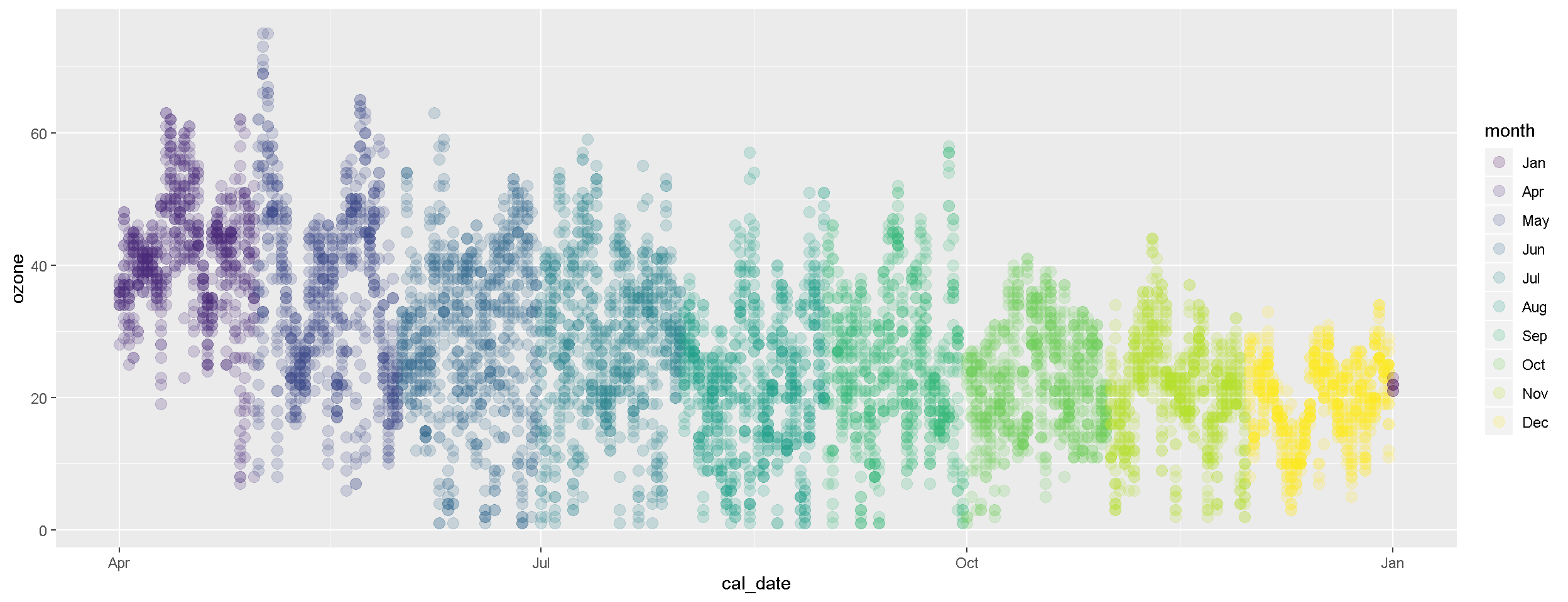
Show me the weather
Maybe some meteorological data would give us some clues about when high ozone is occurring. Unfortunately, concentration and meteorological data often come to us separately, but we want them joined together for easy plotting.
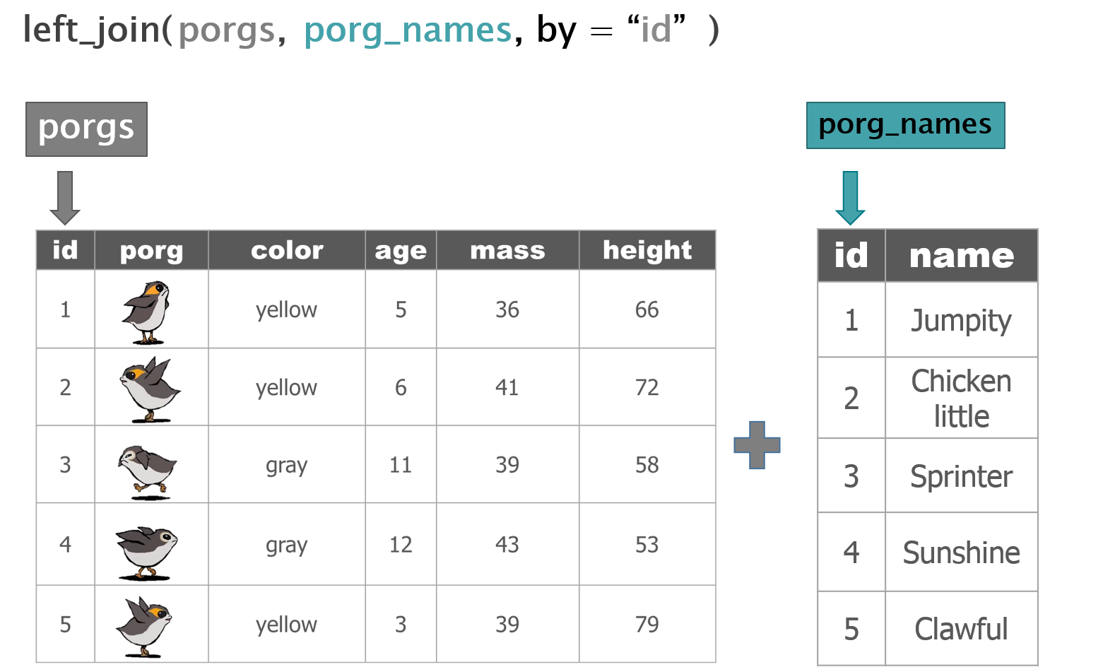
Combine tables with left_join()
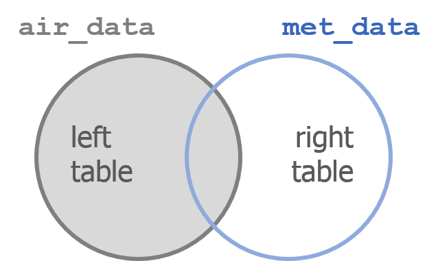
left_join() works like a zipper and combines two tables based on one or more variables. They can have the same name or not. Since it’s left_join, the entire table on the left side is retained. Anything that matches from the right side is retained and the rest is not retained.
Adding porg names
Remember our porg friends? How rude of us not to share their names. Wups!
Here’s a table of their names.
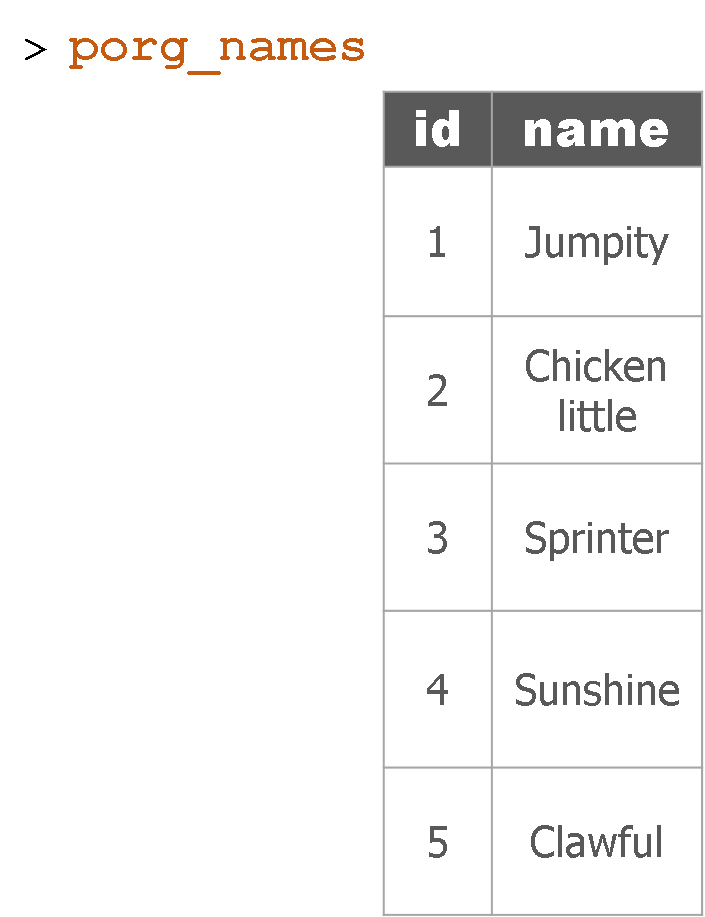
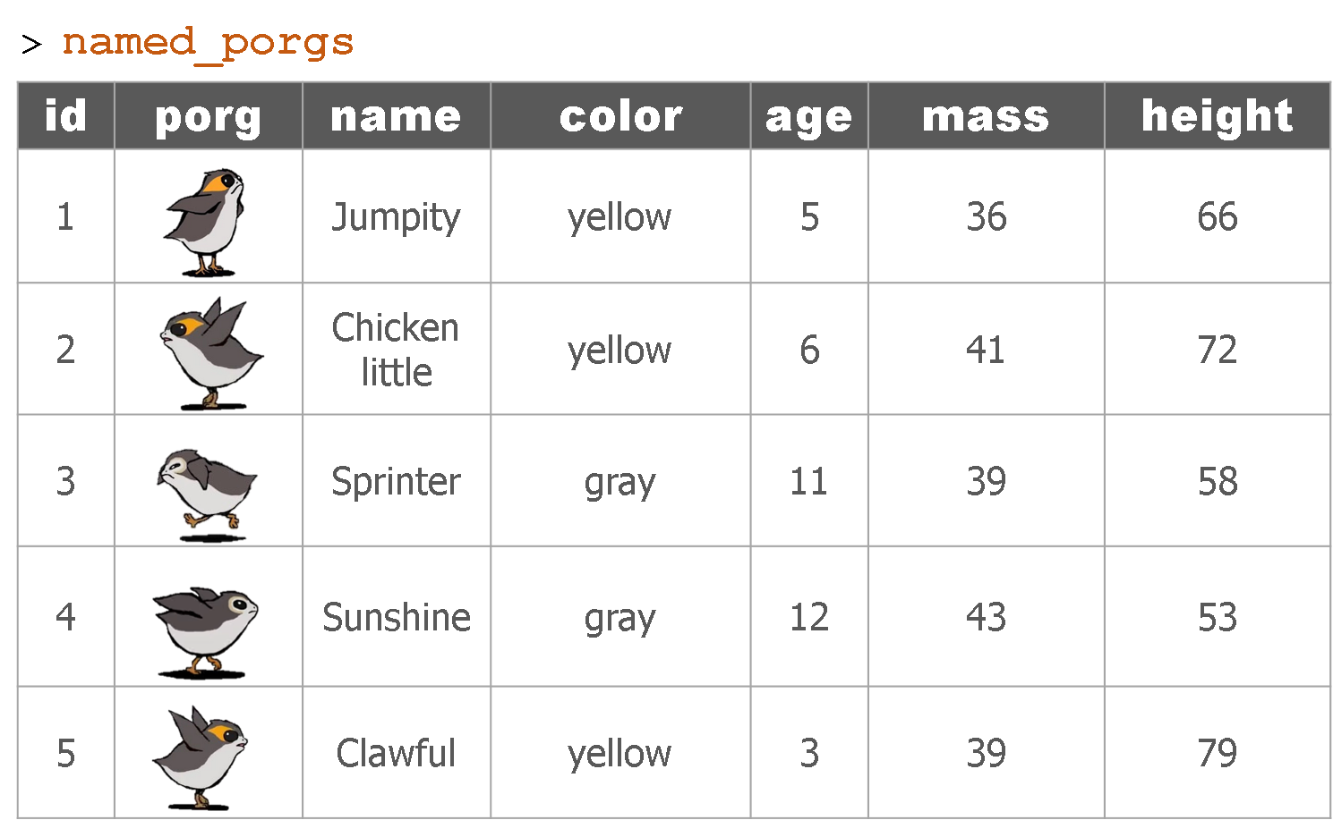
Hey now! That’s not very helpful. Who’s who? Let’s join their names to the rest of the data.
What’s the result?
Let’s try adding MET data to our ozone observations.
met_data <- read_csv("https://itep-r.netlify.com/data/met_data.csv")

ozone_met <- left_join(air_data, met_data,
                       by = c("cal_date" = "date",
                              "site"     = "site",
                              "hour"     = "hour"))
Now we can take a look at our new columns.
glimpse(ozone_met)## Observations: 6,467
## Variables: 14
## $ date_time <dttm> 2015-04-01 06:00:00, 2015-04-01 07:00:00, 2015-04-0...
## $ site <chr> "27-017-7417", "27-017-7417", "27-017-7417", "27-017...
## $ ozone <dbl> 37, 37, 36, 36, 36, 28, 34, 38, 35, 34, 34, 36, 36, ...
## $ lat <dbl> 46.71369, 46.71369, 46.71369, 46.71369, 46.71369, 46...
## $ lon <dbl> -92.51172, -92.51172, -92.51172, -92.51172, -92.5117...
## $ temp_f <dbl> 32.60, 32.51, 30.88, 30.78, 30.69, 30.66, 30.76, 44....
## $ units <chr> "PPB", "PPB", "PPB", "PPB", "PPB", "PPB", "PPB", "PP...
## $ year <dbl> 2015, 2015, 2015, 2015, 2015, 2015, 2015, 2015, 2015...
## $ month <ord> Apr, Apr, Apr, Apr, Apr, Apr, Apr, Apr, Apr, Apr, Ap...
## $ day <ord> Wed, Wed, Wed, Wed, Wed, Wed, Wed, Wed, Wed, Wed, We...
## $ hour <dbl> 6, 7, 8, 9, 10, 11, 12, 17, 18, 19, 20, 21, 22, 23, ...
## $ cal_date <date> 2015-04-01, 2015-04-01, 2015-04-01, 2015-04-01, 201...
## $ ws <dbl> 10.62, 9.81, 8.96, 8.16, 9.99, 9.24, 9.28, 12.84, 10...
## $ wd <dbl> 87, 97, 89, 97, 90, 105, 96, 108, 108, 91, 111, 111,...Polar plots
When looking at air concentration data, we often want to know what direction the wind is blowing from when an air pollutant tends to be elevated. This can help to answer if the pollution source is local or if it is more of a regionl issue.
Pairing wind direction and air concentration data helps answer these questions and provide further insights. Polar plots are one way to look at wind data and get to know the wind patterns around your air monitors.
Let’s make sure we’re looking at the data for only one of the sites.
Filter to a single site
ozone_met <- filter(ozone_met, site == "27-017-7417")Plot the wind directions
For wind directions we’ll use a polar plot to align with the compass directions.
Polar plot
ggplot(ozone_met, aes(x = wd, y = ozone)) +
      coord_polar() +
      geom_point(size = 2, alpha = 0.3) +
      scale_x_continuous(breaks = seq(0, 360, by = 90),
                         lim    = c(0, 360),
                         label  = c("","E", "S", "W", "N")) +
      theme_minimal()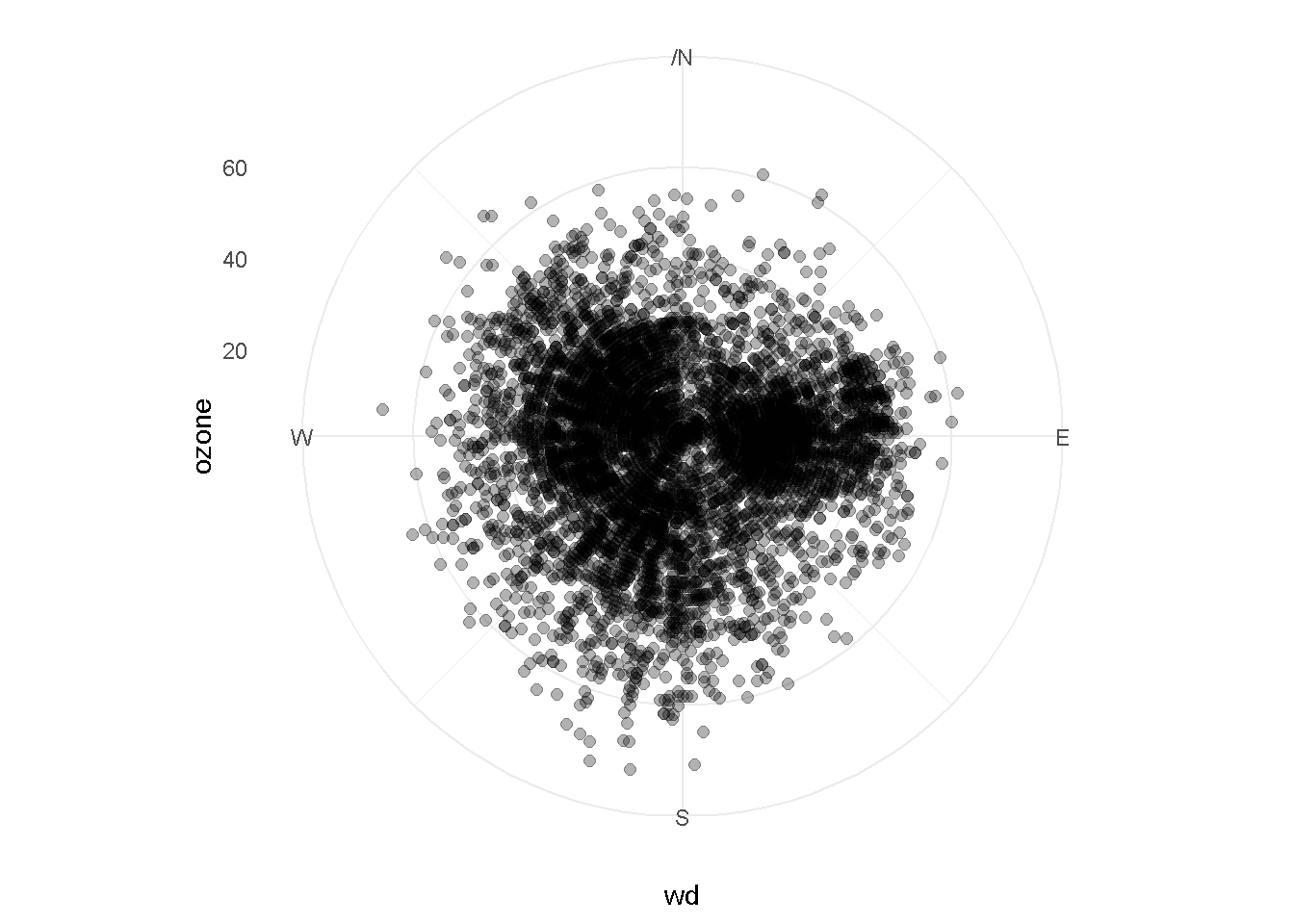
Let’s color the points by ozone concentration
ggplot(ozone_met, aes(x = wd, y = ozone, color = ozone)) +
      coord_polar() +
      geom_point(size = 2, alpha = 0.3) +
      scale_x_continuous(breaks = seq(0, 360, by = 90),
                         lim    = c(0, 360),
                         label  = c("","E", "S", "W", "N")) +
      theme_minimal() +
      scale_color_viridis_c()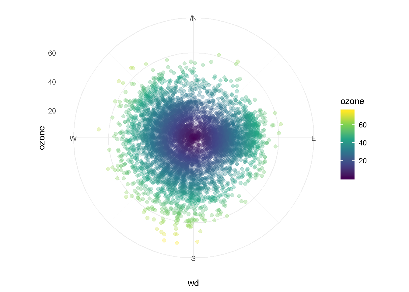
EXERCISE
Let’s experiment with the transparency of the points by changing the alpha = value.
How does changing the value to
alpha = 0.1change the chart?How about
alpha = 0.9?Try increasing and decreasing the
size = 2argument.
Calendar plot
Sometimes with air data we want to know if there is seasonality in the data, or if there were dates with very high values. Calendar plots are great for this.
Let’s make this plot for only the year 2015. To do that we’ll first use
filter().
Filter to a single year
ozone_met <- filter(ozone_met, year == 2015)Filter to a date range
You can also check whether a date is before or after a certain day in history.
ozone_met <- filter(ozone_met, cal_date < "2016-01-01", cal_date > "2014-01-01")Now we can look at our data by hour for each day of the week.
Plot ozone by hour for each day of the week
ggplot(ozone_met, aes(x = day, y = hour, fill = ozone)) +
geom_tile(color = "gray") 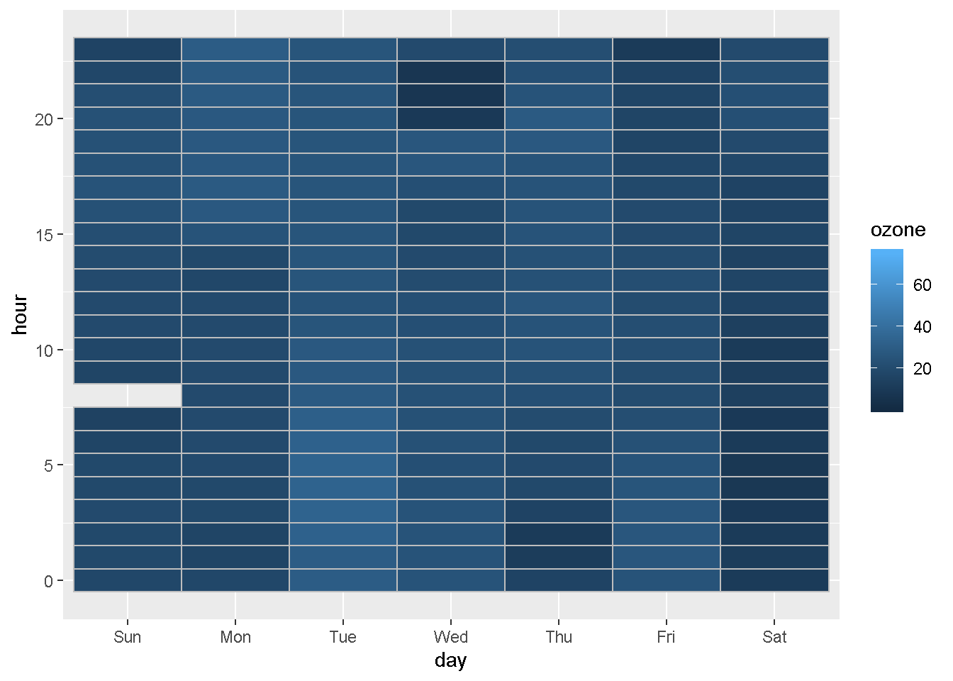
We can also compare concentrations by day of the week for every month.
Plot concentration by day of the week for each month
ggplot(ozone_met, aes(day, month, fill = ozone)) +
  geom_tile(color = "gray")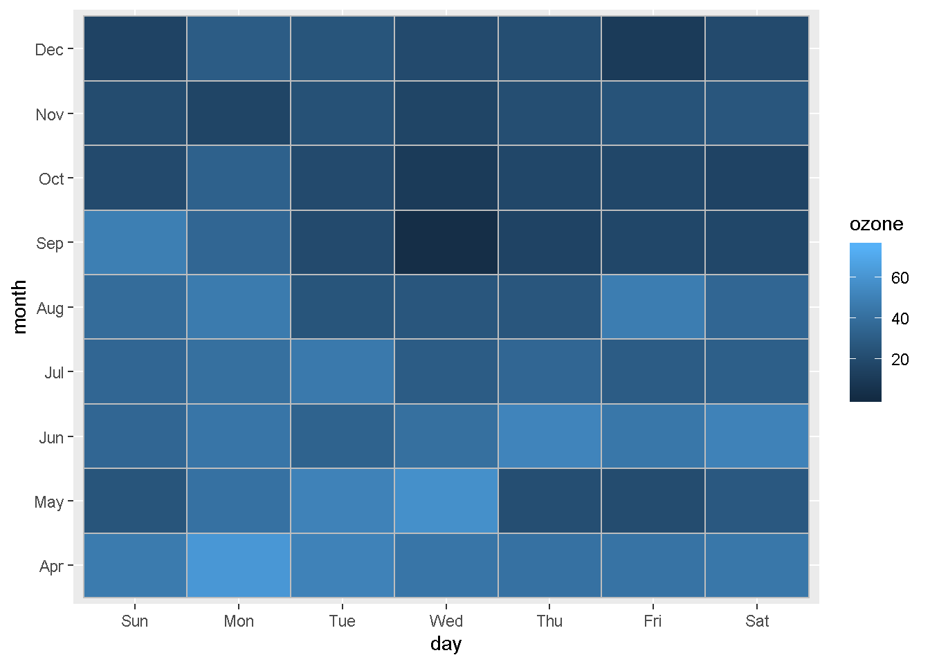
Lastly, let’s compare by day of the week and hour of the day again. But this time, we’ll split it into separate charts for each month.
Plot concentration by hour for each day of the week and month
ggplot(ozone_met, aes(hour, day, fill = ozone)) +
  geom_tile(color = "gray") +
  facet_wrap(~month)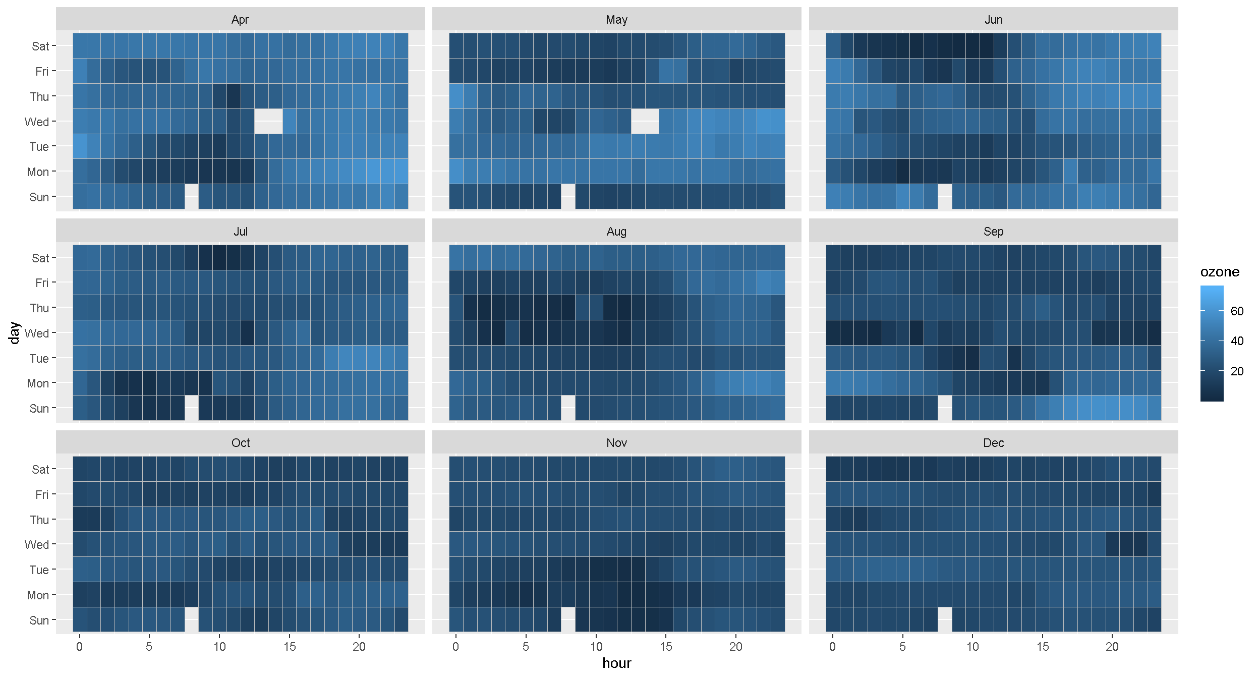
EXERCISE
What do the blank spaces mean? Is there a pattern?
To take a closer look at the missing values you can use filter() to select only the Sunday ozone concentrations. Let’s look at all the data where the day == "Sun" and the hour is between 6 and 10.
Try completing the code below to get a Sunday table.
miss_data <- filter(ozone_met,
day == ______,
hour > ______,
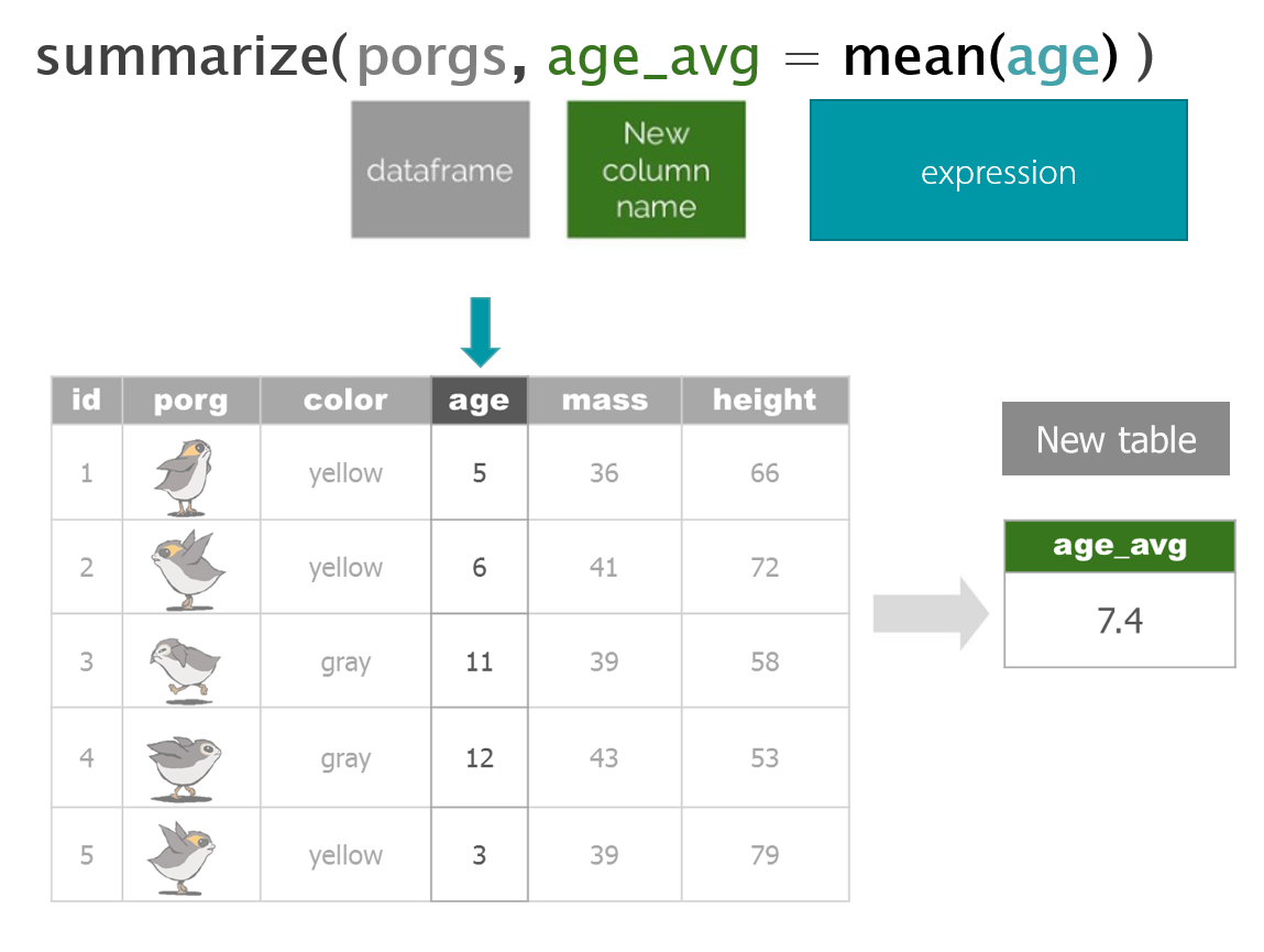
hour < ______ )6. | Group and Summarize the data
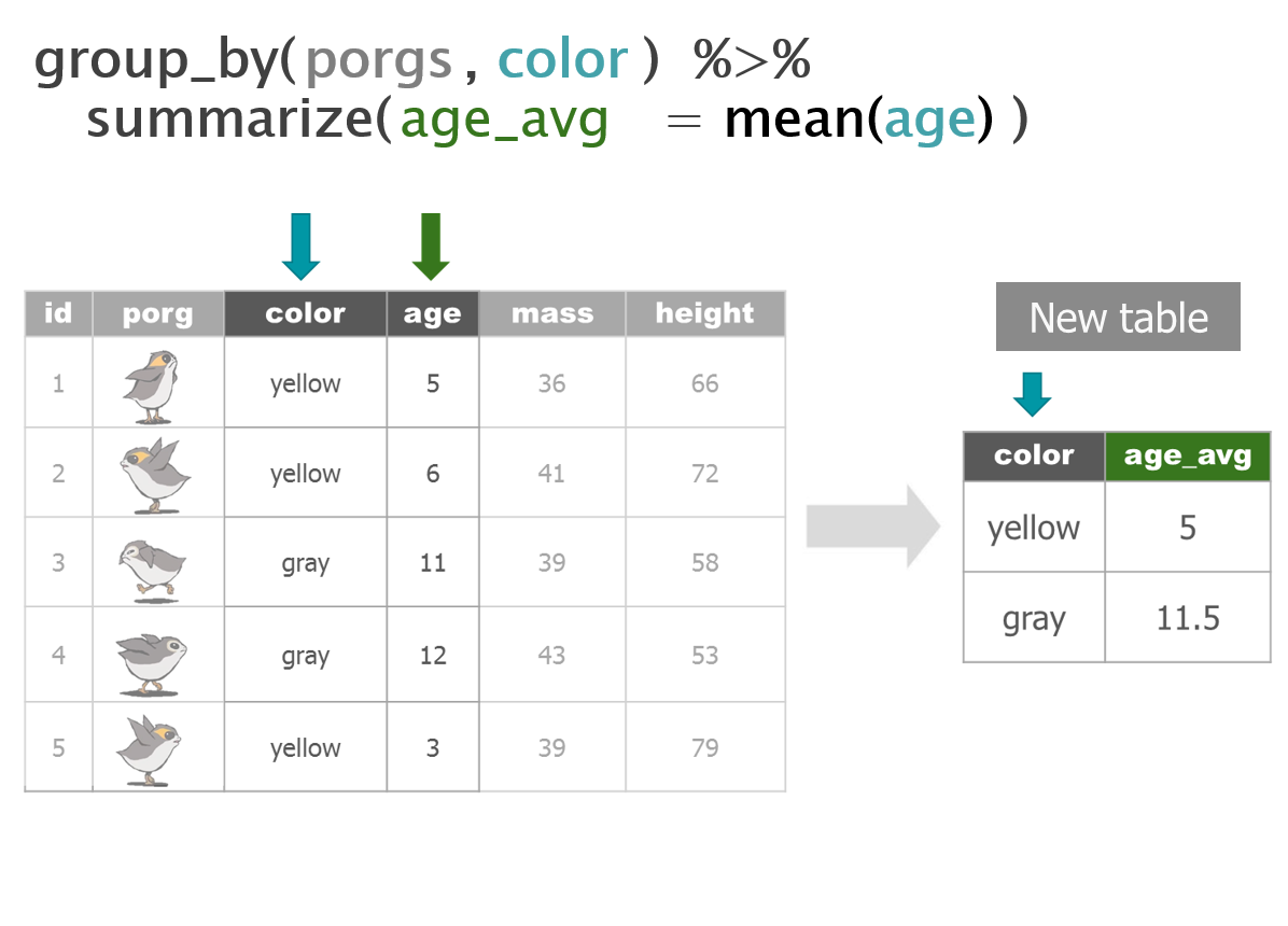
To calculate a summary statistic for each group in the data we use group_by().
First group the data by month and by site.
air_data <- group_by(air_data, site, month)Next use
summarize()to make a table showing the average ozone concentration for each group. Summarize automatically includes a result for each group that we created above.
air_summary <- summarize(air_data, avg_ozone = mean(ozone))| site | month | avg_ozone |
|---|---|---|
| 27-017-7417 | Jan | 21.83333 |
| 27-017-7417 | Apr | 41.14162 |
| 27-017-7417 | May | 35.58921 |
| 27-017-7417 | Jun | 29.67382 |
| 27-017-7417 | Jul | 28.77980 |
| 27-017-7417 | Aug | 22.38042 |
| 27-017-7417 | Sep | 24.92604 |
| 27-017-7417 | Oct | 22.46959 |
| 27-017-7417 | Nov | 20.95319 |
| 27-017-7417 | Dec | 19.32316 |
EXERCISE
Let’s plot our summary table for Rey. If we want column showing the average concentration for each month, we can use geom_col().
Here’s a template to get started. Fill in x = and y = to complete the plot.
ggplot(air_summary, aes(x = ---- , y = --- , fill = avg_ozone)) +
  geom_col()
Add labels
We can add lables to the chart by adding the labs() layer. Let’s give our chart from above a title.
Titles and labels
ggplot(air_summary, aes(x = month , y = avg_ozone, fill = avg_ozone)) +
     geom_col() +
     labs(title    = "2015 Ozone by Month",
          subtitle = "Concentration in PPB",
          y = "OZONE")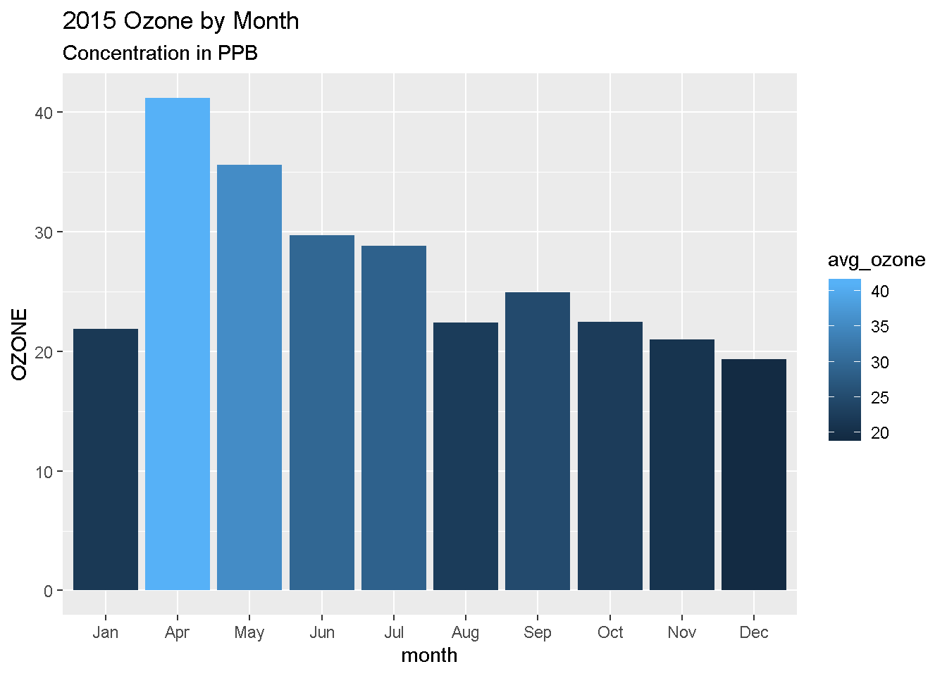
More layers! Rey’s been advised to avoid concentrations over 22 ppb. Let’s add that as a horizontal line to our chart. For that, we use
geom_hline().
Add lines
Reference lines
ggplot(air_summary, aes(x = month , y = avg_ozone, fill = avg_ozone)) +
     geom_col() +
     labs(title    = "2015 Ozone by Month",
          subtitle = "Concentration in PPB",
          y = "OZONE") +
     geom_hline(yintercept = 22, color = "tomato", size = 2)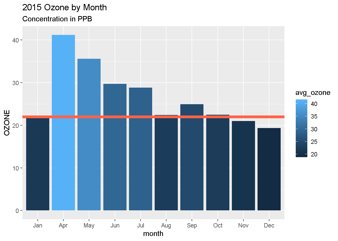
7. | Save results
Save the summarized data table
write_csv(air_summary, "2015-2017_ozone_summary.csv") Bonus Save to AQS format
AQS format is similar to a CSV, but instead of a , it uses the | to separate values. Oh, and we also need to have 28 columns.
# Load packages
library(readr)
library(dplyr)
library(janitor)
library(lubridate)
library(stringr)

# Columns names in AQS
aqs_columns <-  c("Transaction Type", "Action Indicator", "State Code",
                  "County Code", "Site Number", "Parameter",
                  "POC", "Duration Code", "Reported Unit",
                  "Method Code", "Sample Date", "Sample Begin Time",
                  "Reported Sample Value", "Null Data Code", "Collection Frequency Code",
                  "Monitor Protocol ID", "Qualifier Code - 1", "Qualifier Code - 2",
                  "Qualifier Code - 3", "Qualifier Code - 4", "Qualifier Code - 5",
                  "Qualifier Code - 6", "Qualifier Code - 7", "Qualifier Code - 8",
                  "Qualifier Code - 9", "Qualifier Code - 10", "Alternate Method Detection Limit",
                  "Uncertainty Value")

# Read in our data
my_data <- read_csv("https://itep-r.netlify.com/data/ozone_samples.csv")

# Clean the names
my_data <- clean_names(my_data)

# View the column names
names(my_data)
## [1] "date_time" "site" "ozone" "latitude" "longitude" "temp_f"
## [7] "units"# Format the date column
# Date is in year-month-day format, use "ymd_hms()"
my_data <- mutate(my_data, date_time = ymd_hms(date_time),
cal_date = date(date_time))
# Remove dashes from the date, EPA hates dashes
my_data <- mutate(my_data, cal_date = str_replace_all(cal_date, "-", ""))
# Add hour column
my_data <- mutate(my_data, hour = hour(date_time),
time = paste(hour, ":00"))
# Create additional columns
my_data <- mutate(my_data,
state = substr(site, 1, 2),
county = substr(site, 4, 6),
site_num = substr(site, 8, 11),
parameter = "44201",
poc = 1,
units = "007",
method = "003",
duration = "1",
null_data_code = "",
collection_frequency = "S",
monitor = "TRIBAL",
qual_1 = "",
qual_2 = "",
qual_3 = "",
qual_4 = "",
qual_5 = "",
qual_6 = "",
qual_7 = "",
qual_8 = "",
qual_9 = "",
qual_10 = "",
alt_meth_det = "",
uncertain = "",
transaction = "RD",
action = "I")
# Put the columns in AQS order
my_data <- select(my_data,
transaction, action, state, county,
site_num, parameter, poc, duration,
units, method, cal_date, time, ozone,
null_data_code, collection_frequency,
monitor, qual_1, qual_2, qual_3, qual_4,
qual_5, qual_6, qual_7, qual_8, qual_9,
qual_10, alt_meth_det, uncertain)
# Set the names to AQS
names(my_data) <- aqs_columns
# Save to a "|" separated file
write_delim(my_data, "2015_AQS_formatted_ozone.txt",
delim = "|",
quote_escape = FALSE)
# Read file back in
aqs <- read_delim("2015_AQS_formatted_ozone.txt", delim = "|")Save plots
ggsave("Ozone_by_month.png")8. | Share with friends
Having an exact record of what you did can be great documentation for yourself and others. It’s also handy for when you want to repeat the same analysis on new data. Then all you need to do is copy the script, update the one read data line, and push run to get your new set of fancy charts.
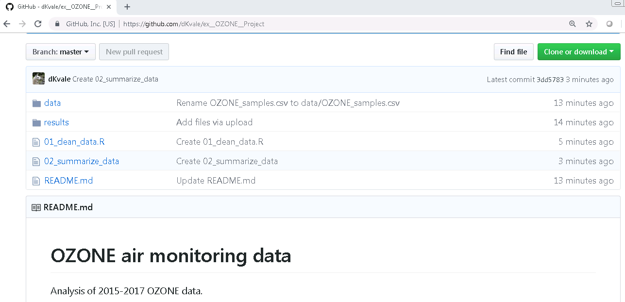
Share on GitHub
Congratulations!
You’ve added some great tools to your data analysis tool belt. Now go forth and put them to use.
More data awaits you…

Help!
Lost in an ERROR message? Is something behaving strangely and want to know why?
See the Help! page for some troubleshooting options.
Key terms
package |
An add-on for R that contains new functions that someone created to help you. It’s like an App for R. |
library |
The name of the folder that stores all your packages, and the function used to load a package. |
function |
Functions perform an operation on your data and returns a result. The function sum() takes a series of values and returns the sum for you. |
argument |
Arguments are options or inputs that you pass to a function to change how it behaves. The argument skip = 1 tells the read_csv() function to ignore the first row when reading in a data file. To see the default values for a function you can type ?read_csv in the console. |
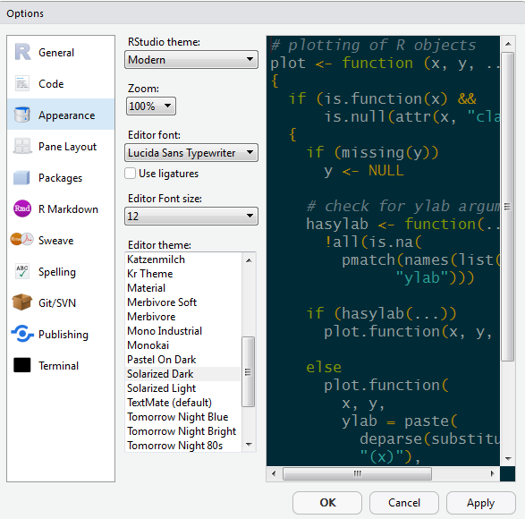
Customize R Studio
Make it your own
Let’s add a little style so R Studio feels like home since you will spend lots of time here. Follow these steps to change the font-size and and color scheme:
- Go to Tools on the top navigation bar.
- Choose
Global Options... - Choose
Appearancewith the paint bucket. - Find something you like.